How to Letter Your First Word: A Step-by-Step Beginner Project
Take one short word from blank paper to a finished inked piece: choose the word, rule guide lines, sketch skeleton letters, check spacing, add style, ink and erase, with fixes for when a letter goes wrong.
Lesson at a glance
What you need
- HB pencil
- Soft eraser
- Ruler
- Fineliner pen
- Two sheets of smooth paper
Practice rows build control, but at some point you want something finished to look at. A single word is the right size for a first hand lettering project: small enough to complete in one sitting, complete enough to take you through every stage from blank paper to dry ink.
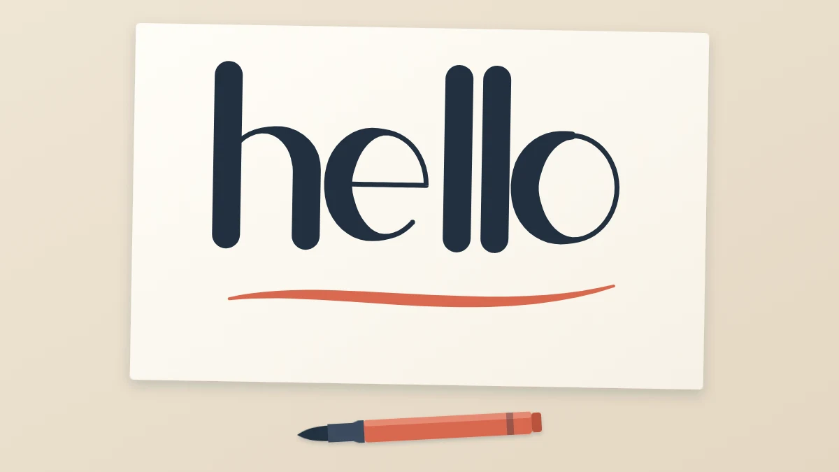
The example here is “hello”, drawn in a simple even-line style with a fineliner. You can swap in another word and another style, and the order of work stays the same: lines, sketch, spacing, style, ink, erase.
Gather your tools and choose a word
You need an HB pencil, a soft eraser, a ruler, a fineliner and two sheets of smooth paper, one for scrap. Nothing else.
A good first word is short and has repeating shapes. Four to six lowercase letters is ideal. Look for doubled letters and letters from the same family, because matching them is good training and makes the word look unified. “hello” has two identical l strokes, a tall h and two round letters. Other friendly choices are “hooray”, “moon”, “bloom” and “minimum” if you feel ambitious.
Rule the guide lines and mark the middle
On your good sheet, rule a baseline, an x-height line about 3/8 in (1 cm) above it and a top line for the tall letters. If you have not done this before, the tutorial on ruling a baseline and guide lines covers the measuring.
Then find the middle of the line and make a small vertical tick there. To center the word, you need to know how wide it will be, so write it once on the scrap sheet at the same size, quickly and without care. Measure that rough version, halve the number and make a second tick that far to the left of the center mark. That is where the word begins.
Sketch the skeleton letters
A skeleton is the thin, one-line version of each letter, with no thickness or decoration. Sketch it with a light touch, holding the pencil a little further back than usual.
- Start at the left tick with the stem of the h: a straight line from the top line down to the baseline. Add its arch, leaving the stem just below the x-height line and coming down to the baseline.
- Draw the e: a short horizontal bar halfway up the x-height, then a curve that rises from the right end of the bar, travels over the top, down the left side and opens toward the right at the bottom.
- Draw the two l stems from the top line to the baseline, parallel to the stem of the h.
- Finish with the o as an oval between the baseline and the x-height line.
After each letter, check two things: does it touch its lines, and does it lean the same way as the first stem? Correct it now, while it is one faint line. For more on working in stages like this, see the guide to sketching from rough draft to final ink.
Check the spacing and adjust
Step back, or hold the sheet at arm’s length, and look at the gaps instead of the letters. The white areas between letters should look about equal, which is not the same as measuring equal distances.
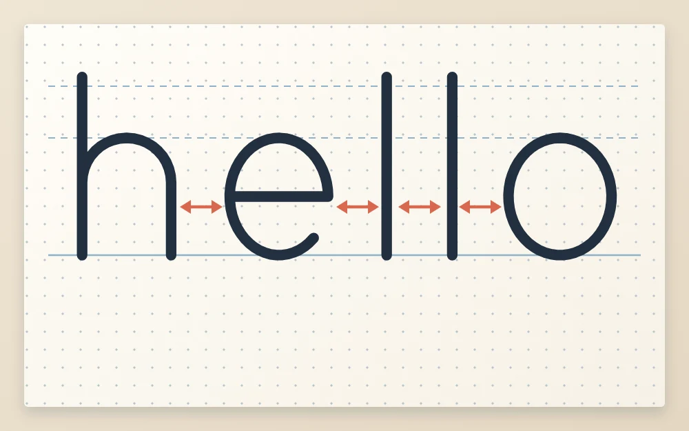
In “hello”, the arrows show four gaps. Two straight stems side by side, as in the double l, need the most distance between them, because straight sides create a narrow, tall slot of white. A round letter beside a straight one, as with e and l or l and o, can sit a little closer, since the curve already leaves white space at its top and bottom.
If one gap looks larger, erase the letters to its right and redraw them a touch closer.
Tip
Turn the page upside down. The word stops reading as a word, and uneven gaps and leaning stems become much easier to spot.
Thicken or style the letters
Now decide how the finished word should look. Two options suit a first project:
- Leave it even. Keep the skeleton as a single clean line. This is monoline lettering, and it looks crisp and modern with no extra steps.
- Draw in the thick strokes. Add a second pencil line beside every stroke where the pen traveled downward, such as the stems of h and l and the left side of the o, then fill the space between. A fineliner cannot make a thick line by pressure the way a brush pen can, so the weight is drawn.
Whichever you choose, apply it to every letter. Keep all thickened parts the same width; a strip of paper with two pencil marks makes a handy gauge.
Ink, wait, erase
- Rest your hand on the scrap sheet so it does not smear the pencil.
- Go over each letter in fineliner at a steady, medium speed. Pull strokes toward you where you can, and turn the paper for awkward curves.
- Ink outlines first, then fill any thick areas.
- Wait until the ink is fully dry. Give it several minutes at least, and longer on very smooth paper.
- Erase the guide lines and the sketch gently, in one direction, holding the sheet flat.
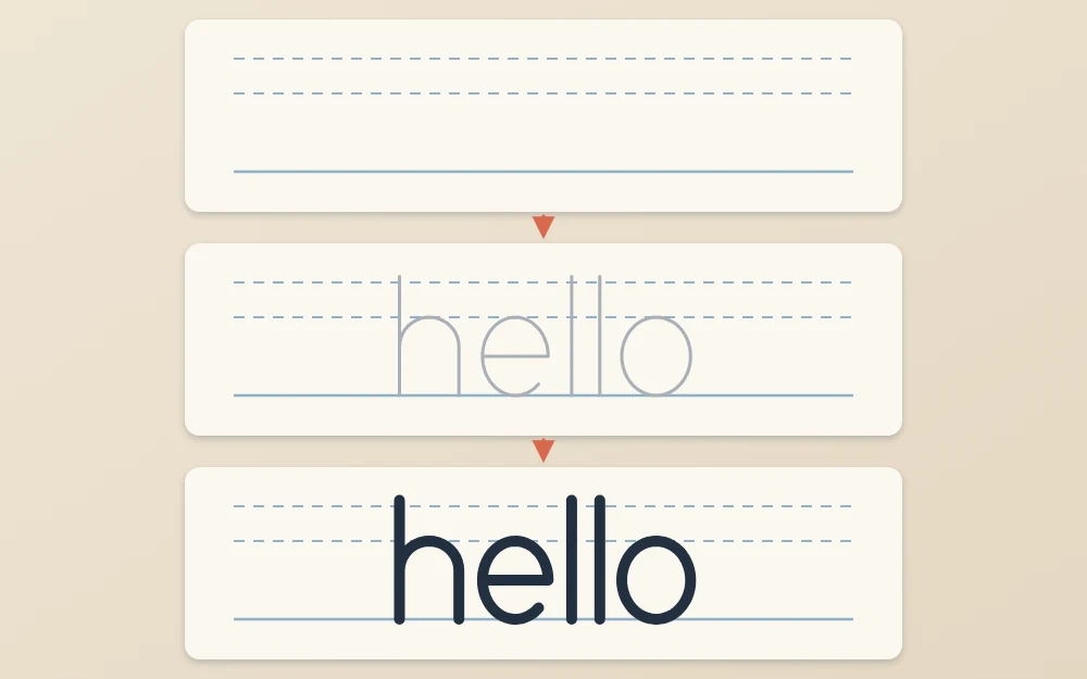
Left-handed readers can ink from right to left, starting with the o, or keep a clean scrap sheet under the hand and let each letter dry for a moment before moving on.
When a letter goes wrong
In pencil, simply erase and redraw; that is what the pencil stage is for. In ink, you have a few honest choices. A slightly thin stroke can be thickened to match the others. A small wobble on an edge can sometimes be absorbed by making that stroke a little heavier, as long as you then match the rest of the word.
A letter in the wrong place cannot be rescued, and that is fine. Start a fresh sheet. The second attempt is usually quicker and better, because the decisions are already made.
Repeat the project with a new word
Date the finished piece and keep it. Then run the same sequence again with a different word, changing only one thing each time: a longer word, a slanted version, capitals only, or thick strokes where you used an even line before.
Each round makes the stages feel more natural. After five or six words you will have a small set of finished pieces and a dependable routine to carry into longer phrases.
Frequently asked questions
What is a good first word to letter?
Choose a short lowercase word of four to six letters with repeated or related shapes, such as hello, moon or bloom. Doubled letters and round letters from the same family give you something to match, which makes the word look unified. Leave words with several diagonal letters like k, x and z for later.
How do I center a word on the page?
Write the word roughly on scrap paper at the size you plan to use and measure its width. Mark the middle of your guide lines, then measure half the word's width to the left of that mark. Begin the first letter there. Expect to be slightly off the first time and adjust on the next attempt.
Can I fix a mistake after inking?
Small ones, sometimes. A stroke that came out thin can be thickened, and a slight wobble can be hidden by adding a little weight, provided you match the other letters afterward. A letter that is misplaced or the wrong shape cannot really be repaired in ink, so starting a fresh sheet is usually the cleaner answer.