How to Draw a Simple Hand Lettering Alphabet of Your Own
Build a plain lowercase alphabet from basic strokes by sorting the 26 letters into five shape families, drawing one family per row, and then changing one rule at a time to make it your own.
Lesson at a glance
What you need
- HB pencil
- Soft eraser
- Ruler
- Fineliner pen
- Smooth printer paper
Your first hand lettering alphabet does not have to come from anyone else. The 26 lowercase letters are made from a handful of repeating shapes, and once you can draw those shapes you can assemble every letter yourself.
What follows is a way to build a plain skeleton alphabet, the thin one-line version of each letter, by sorting letters into families and drawing one family per row. You will finish with a full lowercase set that is yours to adjust.
What you need
- An HB pencil and a soft eraser
- A ruler
- Smooth printer paper, or a dot grid pad
- A fineliner for going over the letters you want to keep (optional)
Rule five sets of guide lines: baseline, x-height line, ascender line and descender line. An x-height of about 3/8 in (1 cm) is comfortable for pencil. If any of those names are new, the guide to the parts of a letter explains them.
Why this site has no alphabet to copy
A model alphabet gives you 26 outlines to imitate. It does not show you that a, d, g and q are the same oval with different stems. When you build letters from shapes, each new letter reuses something you already know, and the finished alphabet is original work instead of a version of someone else’s.
The raw material is the set of eight basic lettering strokes. For a plain skeleton alphabet you mostly need three of them: the downstroke, the oval and the overturn, which is the arch at the top of an n.
Sort the 26 letters into five families
Group letters by the shape that dominates them.
| Family | Letters | Shared shape |
|---|---|---|
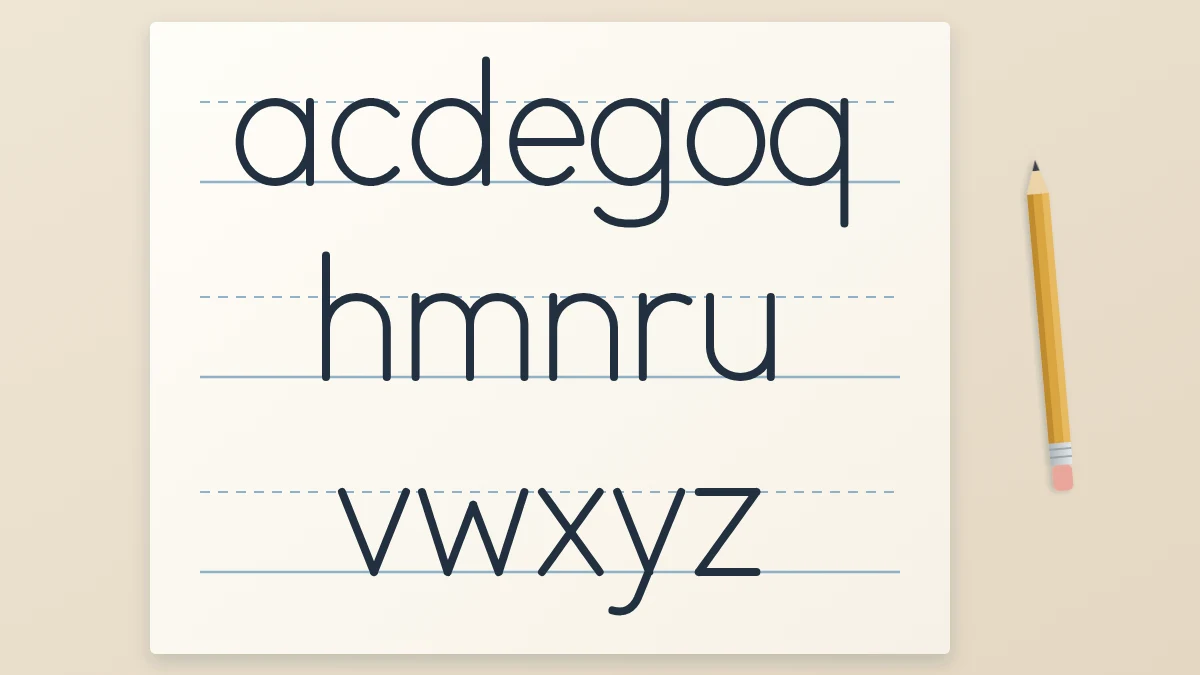
| Round | a c d e g o q | The oval |
| Arch | h m n r u | A stem plus an arch |
| Straight | i l t f j k | One vertical stem |
| Diagonal | v w x y z | Slanted straight lines |
| Odd ones | b p s | Mixed |
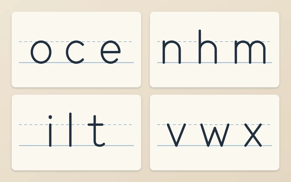
Draw each family as a row
Give every family its own set of guide lines. Draw the key letter several times, then the rest of the family beside it.
Round letters
Begin with o. Start just below the x-height line at about one o’clock, travel left over the top, down the left side, around the baseline and back up to close. For c, follow the same path and stop at about four o’clock. For e, draw a short horizontal bar across the middle first, then continue up and around like a c.
The other four are the oval plus a downstroke on its right side: a from the x-height line to the baseline, d from the ascender line, q straight down to the descender line, and g down to the descender line with a hook curving left.
Arch letters
For n, draw a downstroke from the x-height line to the baseline. Go back up the stem, branch off to the right near the top, curve over and come straight down. An m is two narrower arches. An h is an n whose stem starts at the ascender line. An r is the stem with only the start of the arch. A u is the n turned upside down: down, around along the baseline, up, then a straight downstroke on the right.
Straight letters
An i is a downstroke with a dot above it, and an l is a downstroke from the ascender line. Start t a little above the x-height line and put its crossbar on that line. Start f with a small hook just under the ascender line, come straight down, and add a crossbar at the same height. A j is an i that continues below the baseline and hooks left. A k is a tall stem with two diagonals that meet it about halfway up the x-height.
Diagonal letters
A v is two diagonals meeting in a point on the baseline, and a w is two narrow v shapes. For x, cross two diagonals at the center. A y is a v whose right diagonal runs on to the descender line. A z is a bar along the x-height line, a diagonal down to the left, and a bar along the baseline.
The odd ones
A b is a tall stem with the oval attached on its right, and a p is a stem dropping to the descender line with the oval on its right. The s takes the most patience. Start at the upper right, curve left over the top, cross diagonally through the middle, and curve back to the left along the baseline. Keep the top curve slightly smaller than the bottom one so the letter does not look top-heavy.
Keep the widths related
Use your o as the measure. The oval inside a, b, d, g, p and q should match it. An n, h or u is about as wide as the o or slightly narrower. An m is roughly one and a half times as wide.
After each row, check three things: do the round letters share one oval, do the arches branch from the stem at the same height, and does every letter touch its lines? Redraw the ones that do not. More checks of this kind are in the guide to keeping size, slant and weight even.
Make it yours by changing one rule at a time
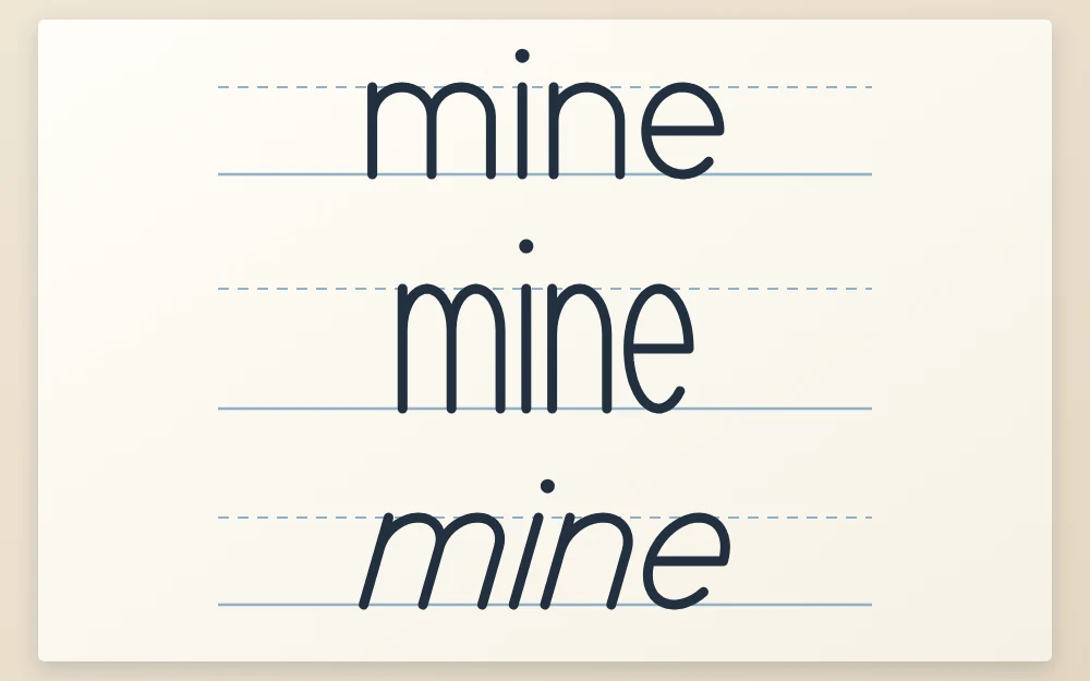
An alphabet is a set of rules applied to every letter. Change one rule, apply it everywhere, and you have a new alphabet.
- X-height: raise it so ascenders are short, or lower it so they are long.
- Width: squeeze the oval into a narrow shape, or widen it toward a circle.
- Slant: lean every stem to the same angle.
Test a change on one short word before redrawing all 26 letters.
How to practice and where to go next
One family per session, at roughly 15 to 20 minutes, is plenty. Finish each session with a word made only from families you have covered, such as “noon” or “humming”.
If you are left-handed and go over letters in ink, let each row dry before moving your hand across it, or rest your hand on a scrap sheet.
This skeleton is already close to a sans serif style, because it has no serifs and one line weight. For matching capitals, the next step is sans serif hand lettering.
Frequently asked questions
Should I learn lowercase or capital letters first?
Lowercase is a practical starting point because most words are written mainly in lowercase and the letters share a small number of shapes, so practice on one letter carries over to others. Capitals are not harder, though. If your first projects are headings or labels in all caps, starting with capitals is perfectly reasonable.
Why should I build an alphabet instead of copying one?
Building from strokes teaches you how letters are related, so you can draw any letter in a matching style, including ones you have not practiced. Imitating a finished sample teaches outlines only. An alphabet you assemble yourself is also original, which matters if you ever want to share or sell your lettering.
Which lowercase letters are the hardest to draw?
Most beginners find s the hardest, because it has no straight line to anchor it and its two curves must balance. The letters a and g can be awkward until the oval is steady, and k takes a few tries to get the diagonals meeting in the right place. Extra rows of those letters usually help.