How to Draw a Simple Hand Lettering Alphabet of Your Own
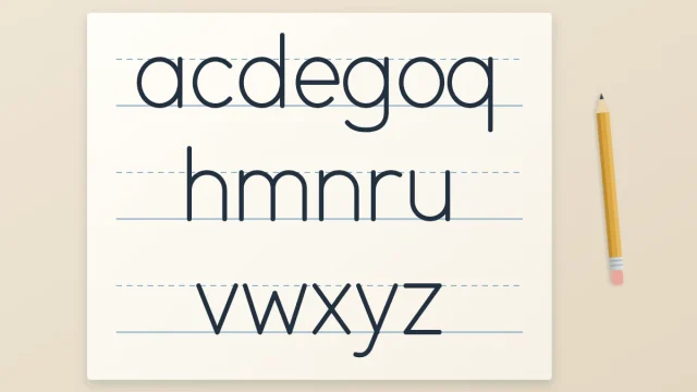
Build a plain lowercase alphabet from basic strokes by sorting the 26 letters into five shape families, drawing one family per row, and then changing one rule at a time to make it your own.
Simple Lettering Lessons and Practice Ideas
Clear, step-by-step lessons for complete beginners: basic strokes, guide lines, simple styles and short practice ideas. All you need to begin is a pencil, a pen and a sheet of paper.
New to lettering? Work through these four guides in order.
Hand lettering is the craft of drawing letters, not writing them. See how it differs from calligraphy and typography, which styles beginners meet first, and why slow, corrected pencil work is part of the method.
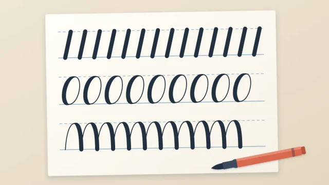
Learn the eight basic strokes that build almost every lowercase letter: where each one starts, which letters it makes, and how to practice it as a row before you move on to whole letters.
A clear order of first steps for complete beginners: the five things to gather, what to learn first, how long to practice, what progress realistically looks like and a plan for your first session.
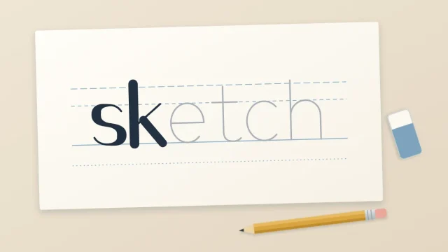
Take one short word from blank paper to a finished inked piece: choose the word, rule guide lines, sketch skeleton letters, check spacing, add style, ink and erase, with fixes for when a letter goes wrong.
First steps for new letterers: where to begin, a first word to finish and the mistakes to avoid.
Build a plain lowercase alphabet from basic strokes by sorting the 26 letters into five shape families, drawing one family per row, and then changing one rule at a time to make it your own.
Ten common beginner lettering problems, from drifting words to shaky lines and uneven gaps, each with its likely cause and one concrete fix to try on your next practice page.
Take one short word from blank paper to a finished inked piece: choose the word, rule guide lines, sketch skeleton letters, check spacing, add style, ink and erase, with fixes for when a letter goes wrong.
A clear order of first steps for complete beginners: the five things to gather, what to learn first, how long to practice, what progress realistically looks like and a plan for your first session.
Beginner-friendly styles explained step by step, from even-line letters to bold capitals.
Draw clean sans serif capitals from three simple shape families, keep their widths related, and vary the result as light, bold, condensed or wide-spaced letters.
What a serif is, four serif shapes a beginner can draw, and a layered method for serif-inspired capitals: skeleton letters, thickened downstrokes, then serifs of equal length at the stem ends.
Draw bold block capitals by building an even band around thin skeleton letters. Covers a paper-strip gauge for equal stroke thickness, round letters, tricky diagonals, inking and simple fills.
A three-step method for getting thick-and-thin letters from an ordinary pen: write the word, add a second line beside every downstroke, then fill it in. Includes how to find downstrokes and keep widths even.
Drills, short routines and homemade practice sheets that build steady lines.
Rule one master guide sheet by hand, ink it dark and slide it under thin paper, so you get reusable practice pages sized for your own pen and style.
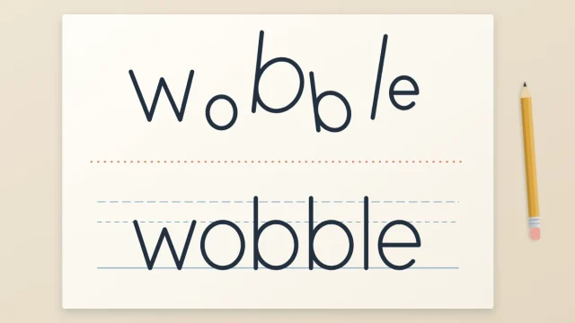
Find out why a word looks uneven when the letters look fine, and fix it by checking four things: height, slant, stroke weight and shared letter shapes.
A simple 15-minute session plan for busy beginners: warm-up strokes, one letter group, one word and a short review, plus a weekly rotation of focus.
Ten simple warm-up drills, from parallel downstrokes to rows of the word minimum, with what each one trains, how many rows to do and what to check.
Spacing, layouts and banners: how to arrange words into a balanced phrase.
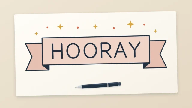
Draw a straight ribbon banner from a rectangle, two end pieces and two fold triangles, then a wavy version from parallel curves. Includes how to fit a word inside and shade the folds.
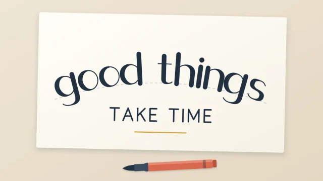
Eight beginner-friendly layout shapes for quotes, cards and signs, from the centered stack to the badge, with advice on blocking each one in rectangles and matching it to the length of your phrase.
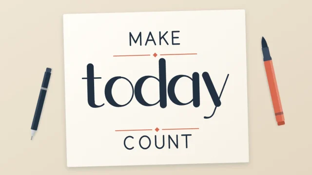
A repeatable six-step process for turning a short phrase into a balanced lettered piece: choose the important words, break the lines, sketch thumbnails, set contrast, rule a frame and check the white space.
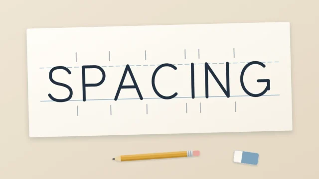
Learn to space letters by the look of the white space instead of by distance, handle awkward pairs such as A, T and V, and set word and line spacing.
Sketching, shadows, flourishes and pen pressure: the techniques that finish a piece.
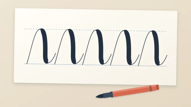
How to control a brush pen: the single pressure rule, the low pen angle that makes it work, four practice strokes and a wave drill for smooth transitions.
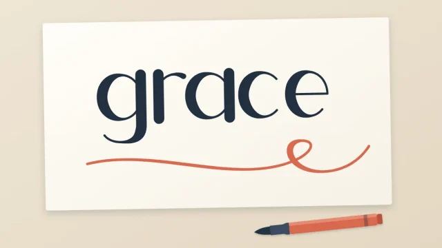
Five easy flourishes that grow out of strokes your word already has, plus four rules and a short warm-up that keep swashes smooth, balanced and readable.
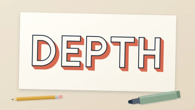
Four shadow effects in rising difficulty, from a thin drop line to a solid 3D block, with one rule that keeps them all convincing: a single light direction.
A dependable sketch-to-ink routine: four pencil passes that fix layout, shape, weight and spacing, followed by a calm inking order that keeps the page clean.
Pick a topic to see every lesson filed under it.
Small lettering projects for spring, summer, fall and winter, each with a word list, a suggested style, one simple motif to draw and a color idea.
Three original card layouts for beginners: one big word, a two-line stack and a word in a banner, with planning steps, simple motifs and tips for cardstock.
How to control a brush pen: the single pressure rule, the low pen angle that makes it work, four practice strokes and a wave drill for smooth transitions.
Five easy flourishes that grow out of strokes your word already has, plus four rules and a short warm-up that keep swashes smooth, balanced and readable.
Four shadow effects in rising difficulty, from a thin drop line to a solid 3D block, with one rule that keeps them all convincing: a single light direction.
A dependable sketch-to-ink routine: four pencil passes that fix layout, shape, weight and spacing, followed by a calm inking order that keeps the page clean.
Letters are built from a small set of simple shapes. Learn those first and every style that follows becomes easier to draw. Every lesson is free to read, with no sign-up needed.