Lettering Guidelines: How to Draw Baselines and Guide Lines
Rule a baseline, x-height and cap height with a pencil and ruler: how to choose an x-height, use a simple 2:1 or 3:2 ratio, space lines of text and add slant lines for italic styles.
Lesson at a glance
What you need
- Sharp HB pencil
- Ruler
- Soft eraser
- Smooth paper
- Dot grid pad or graph paper (optional)
When a word climbs uphill, shrinks toward the end or swells in the middle, the cause is rarely your hand. It is the missing structure underneath. Lettering guidelines are light pencil lines that tell each letter where to stand and where to stop, and ruling them takes only a few minutes.
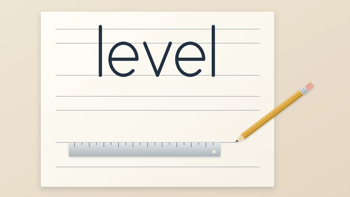
On this site the lines themselves are called guide lines. You need three for most work: a baseline, an x-height line and a cap height line, plus a descender line when the word has tails. Below is a way to rule them accurately with nothing more than a pencil and a ruler.
What you need
- A sharp HB pencil, which makes a fine line that erases cleanly
- A ruler, ideally a clear one or a steel one with fine markings
- A soft eraser
- Smooth paper with at least one straight edge to measure from
If the names of the lines are new to you, the guide to letter anatomy explains what each one controls.
Choose an x-height first
The x-height is the height of your small lowercase letters, and every other measurement follows from it. For a fineliner or pencil, 3/8 in (1 cm) is a comfortable starting size: large enough to see mistakes, small enough to fit a word across a page.
Go larger for wider tools. A small firm-tip brush pen suits an x-height of about 1/2 in (1.3 cm), and a large soft-tip brush pen may need 3/4 in (2 cm) or more. If your thick strokes fill in the counters of a and e, the x-height is too small for the pen.
Pick a simple ratio
Next decide how much room the tall strokes get above the x-height line. Two ratios are easy to measure and look balanced:
- 2:1. The ascender space is half the x-height. With a 3/8 in x-height, the space above is 3/16 in (5 mm). Letters look round, sturdy and friendly.
- 3:2. The ascender space is two thirds of the x-height. With a 3/8 in x-height, the space above is 1/4 in (6 mm). Letters look a little taller and more elegant.
Use the same measurement below the baseline for the descender space. For a first sheet, let the capitals and the ascenders share one top line. You can separate them later, with the cap height slightly lower, once that small difference starts to matter to you.
Rule one set of lines
- Lay the ruler vertically near the left edge of the paper, with zero at the top edge. Make a small tick where the top line will be, for example 1 in (2.5 cm) down.
- From that tick, measure down the ascender space and mark the x-height line. Measure down the x-height and mark the baseline. Measure down the descender space and mark the descender line.
- Move the ruler to the right edge of the paper and repeat the same four ticks, again measuring from the top edge.
- Join each pair of ticks with a light line. Hold the ruler firmly with spread fingers and draw in one pass.
- Check the result by measuring the x-height in the middle of the sheet. It should match the edges.
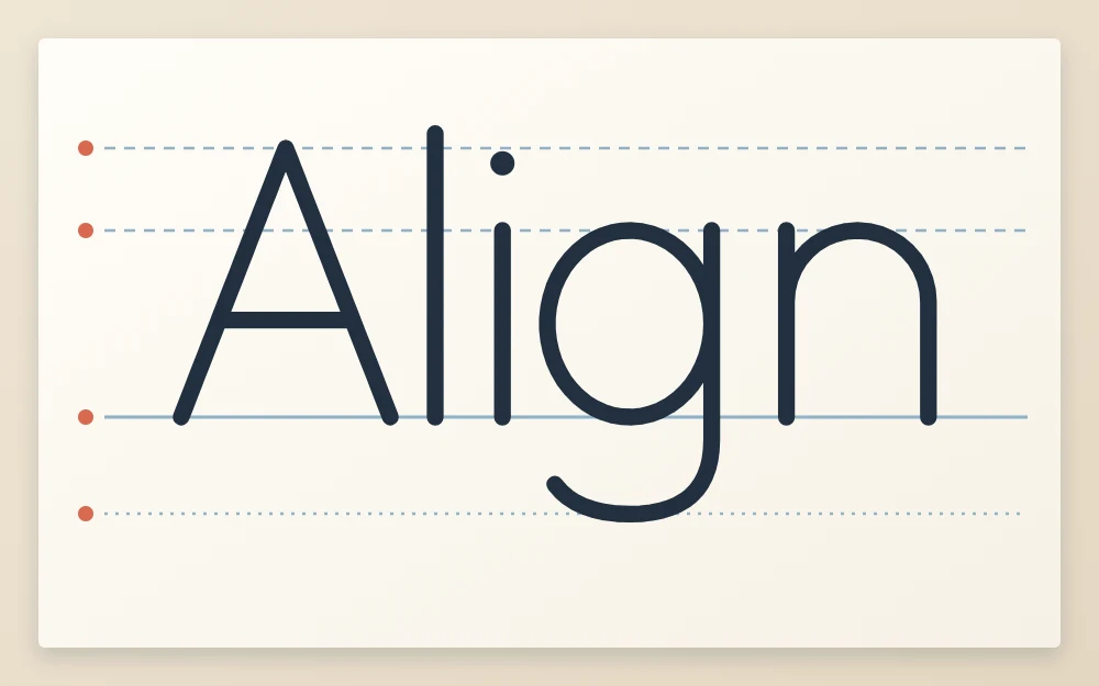
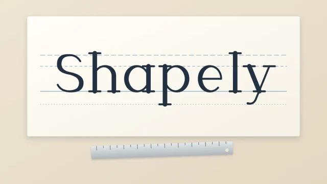
In the example word, the capital A and the tall l reach the top line, the small letters i and n stop at the x-height line, and only the g uses the space below the baseline. Nothing floats and nothing pokes through.
Common mistake
Measuring each line from the one above at only one side of the page, then drawing the lines by eye. Small errors add up and the lines tilt. Always mark both sides.
Draw lightly so the lines erase
Guide lines are temporary. Let the weight of the pencil do the work and keep the point sharp; you should be able to see the line clearly but not feel a groove in the paper. Heavy lines leave dents that stay visible after erasing and can catch a pen tip.
Erase only when the ink is fully dry, with gentle strokes in one direction. Left-handed readers may find it easier to turn the sheet upside down and rule from the other side, so the hand does not drag across fresh pencil and gray the page.
Space between lines of text
For two or more lines of lettering, repeat the whole set further down the page. Leave a gap between the descender line of one set and the top line of the next, so that a hanging g never collides with a tall h below it.
A gap of about half the x-height is a sensible default. Looser spacing, up to a full x-height, makes longer text calmer and easier to read.
Add slant lines for italic styles
Script and italic styles lean, and the lean has to be the same in every letter. Slant lines are parallel diagonal pencil lines drawn across the set of guide lines to show that angle.
- Choose an angle. A slant of roughly 60 to 70 degrees from the baseline suits most beginner scripts.
- Without a protractor, mark a point on the baseline, then a second point two units up and one unit to the right. The line through both leans at about 63 degrees.
- Draw that first slant line through the full height of the set.
- Mark the baseline and the top line every 3/8 in from the first line, then join the marks to make parallel slant lines.
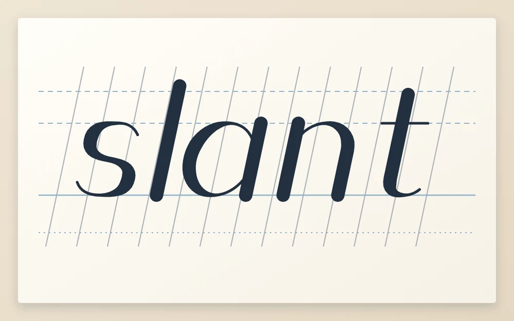
You do not draw on top of the slant lines. You compare against them: each stem and each downstroke should run parallel to whichever line is closest. If keeping one angle is your main difficulty, the article on keeping size, slant and weight even has targeted fixes.
Dot grid and graph paper as ready-made guides
A dot grid pad or graph paper saves ruling time. Count squares instead of measuring: for instance, two squares for the x-height and one square each for the ascender and descender space gives a 2:1 ratio straight away.
The trade-off is that the grid fixes your sizes and stays visible in the finished piece. For final work on plain paper, ruling by hand is still worth knowing. For repeated practice, you can rule one dark master sheet and reuse it under thin paper, as described in the guide to making your own practice sheets.
Frequently asked questions
What x-height should a beginner use?
About 3/8 in (1 cm) works well with a fineliner or pencil. It is large enough to show wobbles and uneven shapes, yet small enough to fit a word on one line. Brush pens need more room, often 1/2 in (1.3 cm) or larger, so that thick strokes do not fill the inside of the letters.
Do I need a protractor to draw slant lines?
No. Mark a point on the baseline, then count two units up and one unit across and mark a second point. A line through both leans at roughly 63 degrees, which suits most beginner scripts. Repeat the line at even intervals along the baseline to make a parallel set you can compare your downstrokes against.
How do I erase guide lines without smudging the ink?
Wait until the ink is completely dry, which can take several minutes on smooth or coated paper. Test a corner with a fingertip first. Then use a soft eraser with gentle strokes in one direction, holding the sheet flat with your other hand. Lines drawn lightly with a sharp HB pencil lift far more easily.