Monoline Lettering: A Beginner’s Guide to Even-Weight Letters
What monoline means, which ordinary pens produce it, how to keep an even line steady, and how to draw a monoline print style, a simple connected script and a few easy variations.
Lesson at a glance
What you need
- HB pencil
- Soft eraser
- Ruler
- Fineliner pen
- Bullet-tip marker
- Dot grid pad
Monoline lettering is the style where every stroke has the same thickness, from the first stem to the last curve. It looks clean and modern, it suits labels, cards and headings, and it needs nothing more specialized than a pen that makes one steady line.
That simplicity is also the challenge. With no thick strokes to hide behind, the shapes and the spacing do all the work. This guide covers the tools, how to keep lines steady, a print style, a simple script and a few easy variations.
What monoline means
The word describes the line, not the letter shapes: mono for one, line for line weight. A monoline letter can be upright or slanted, print or script, capitals or lowercase. The only rule is that upstrokes, downstrokes, curves and crossbars are all equally thick.
How hard you press plays no part in the look. Thick downstrokes and thin upstrokes made by pressure belong to flexible tips such as a brush pen. A fineliner draws the same line whether you press lightly or firmly, so hold it lightly and let the tip do the work.
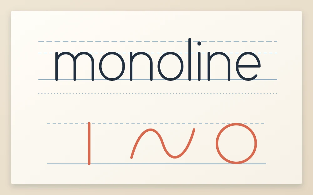
Tools that give one line weight
- Fineliner: a fixed tip and a crisp line. A medium tip is the easiest to control at first.
- Gel pen: smooth and dark, good for small lettering. It needs a moment to dry.
- Bullet-tip marker: a bolder line for larger words and signs.
- Pencil: an HB or 2B for sketching, and for practice when you want to erase.
You also need a ruler, a soft eraser and smooth printer paper or a dot grid pad. Match the pen to the letter size: a fine tip on large letters looks thin and weak, and a broad marker on small letters closes up the counters. The guide to hand lettering pen types compares these tools in more detail.
How to keep monoline strokes steady
An even line shows every wobble, so line control matters more here than in any other beginner style. Four habits help.
- Draw from the arm. For strokes longer than about 3/4 in (2 cm), keep the fingers still and move the forearm. Fingers alone make short, jerky arcs.
- Use a medium speed. Very slow strokes tremble and very fast ones overshoot. Aim for one calm, continuous motion.
- Pull strokes toward you. A pulled line is steadier than a pushed one. Draw verticals from top to bottom.
- Turn the paper. Rotate the sheet so a difficult curve or a long horizontal falls in a comfortable direction.
Warm up with a row of straight downstrokes and a row of ovals before lettering. Both belong to the basic lettering strokes, which are worth practicing with an even-line pen before whole words.
Tip
If you are left-handed, give gel and marker ink a little longer to dry, rest your hand on a scrap sheet, and try turning the paper clockwise so your hand sits below the line you are writing.
A monoline print style, step by step
Print letters stand apart from one another, which makes them a forgiving place to begin.
- Rule a baseline and an x-height line about 3/8 in (1 cm) apart, with an ascender line the same distance above.
- Sketch the word in light pencil as simple skeleton letters. Build round letters on one shared oval and arch letters on one shared arch.
- Check that every letter touches its lines and that the gaps between letters look alike. Adjust in pencil.
- Ink each stroke in one pass, top to bottom for stems and counterclockwise for ovals. Lift the pen between strokes instead of scrubbing back over a line.
- Wait until the ink is fully dry, then erase the pencil.
After inking, look at the joins. Where an arch meets a stem, the two lines should merge cleanly without a blob. If a join looks heavy, you paused there with the tip on the paper. Keep the pen moving through it next time.
A simple monoline script
A monoline script is the same idea with letters connected.
Start from your print letters and add a short exit stroke to each one: a small upward curve that leaves the baseline and reaches toward the next letter. That curve becomes the join. Most joins arrive at the next letter about halfway up the x-height.
Three joins cover most words:
- Baseline to stem: the exit stroke rises and becomes the start of letters like i, u, n and m.
- Baseline to oval: the exit stroke rises to meet the right side of a, c, d, g, o or q. Lift the pen, draw the oval, and let it touch the end of the join.
- Top join: letters that finish high, such as o, v and w, connect with a small dip along the x-height line.
You do not have to write a word in one unbroken line. Lifting the pen after each letter and starting the next at the end of the join gives steadier results. Try “minimum” first, since it is all stems and arches, then a word with ovals such as “good”.
Rounded ends and other finishing touches
The ends of strokes change the mood of the whole style. A bullet-tip marker leaves naturally round ends, which read as soft and friendly. A fineliner leaves blunter ends that look more precise.
On larger letters you can add a tiny dot at each stroke end and blend it in, so the ends look round and deliberate. Do it on every end or on none. A mix looks accidental.
Easy variations to try
Because the line never changes, you create variety through proportion and spacing.
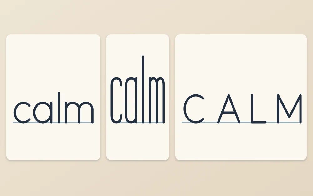
- Tall and narrow: double the x-height, keep the same letter width, and squeeze the ovals into upright shapes.
- Wide and low: stretch ovals sideways and keep ascenders short for a calm, grounded look.
- All caps with wide spacing: draw small capitals and leave gaps about as wide as a letter. This suits short labels and subtitles.
Where to go from here
Expect your lines to steady gradually over several sessions, not all at once.
Once your monoline script feels comfortable, it becomes the base for a thick-and-thin look made with the same ordinary pen. That method is explained in the guide to faux calligraphy, where the thick strokes are drawn in, not pressed.
Frequently asked questions
What pen is best for monoline lettering?
Any pen with a fixed tip that makes one line thickness works: a fineliner, a gel pen or a bullet-tip marker. A medium fineliner is a comfortable starting point because the line is crisp and dries quickly. Choose a broader tip for larger letters so the strokes do not look thin and weak.
Is monoline lettering easier than brush lettering?
It is easier to start, because there is no pen angle or flexible tip to control and an ordinary pen is enough. It is not effortless, though. An even line shows wobbles and uneven spacing clearly, so steady strokes and consistent shapes take regular practice to develop.
Can I do monoline lettering with a pencil?
Yes. A pencil makes an even line and lets you erase, which makes it a good tool for practice and for sketching before ink. Keep the point slightly rounded instead of needle sharp so the line stays the same thickness, and rotate the pencil now and then as the tip wears.