Lettering Styles
Sans Serif Hand Lettering: Clean, Simple Letters for Beginners
Draw clean sans serif capitals from three simple shape families, keep their widths related, and vary the result as light, bold, condensed or wide-spaced letters.
Simple Lettering Lessons and Practice Ideas
Beginner-friendly styles explained step by step: monoline, faux calligraphy, block letters, and serif and sans serif styles.
5 tutorials published
Draw clean sans serif capitals from three simple shape families, keep their widths related, and vary the result as light, bold, condensed or wide-spaced letters.
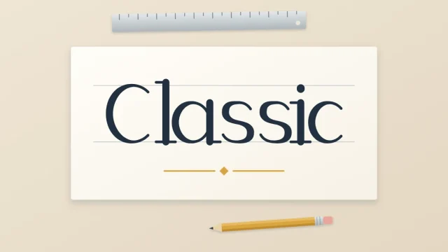
What a serif is, four serif shapes a beginner can draw, and a layered method for serif-inspired capitals: skeleton letters, thickened downstrokes, then serifs of equal length at the stem ends.
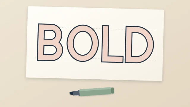
Draw bold block capitals by building an even band around thin skeleton letters. Covers a paper-strip gauge for equal stroke thickness, round letters, tricky diagonals, inking and simple fills.
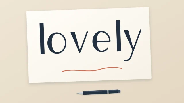
A three-step method for getting thick-and-thin letters from an ordinary pen: write the word, add a second line beside every downstroke, then fill it in. Includes how to find downstrokes and keep widths even.
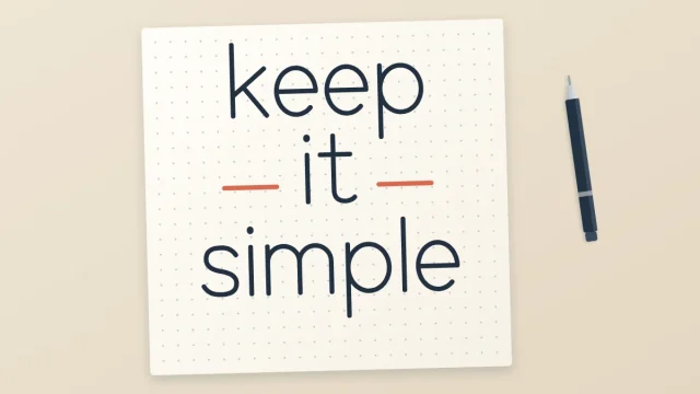
What monoline means, which ordinary pens produce it, how to keep an even line steady, and how to draw a monoline print style, a simple connected script and a few easy variations.