Hand Lettered Christmas Cards: Simple Layouts You Can Draw
Three original card layouts for beginners: one big word, a two-line stack and a word in a banner, with planning steps, simple motifs and tips for cardstock.
Lesson at a glance
What you need
- Blank folded cards and envelopes
- Scrap paper
- HB pencil
- Soft eraser
- Ruler
- Fineliner pen
- Bullet-tip marker or brush pen
A card with one well-placed word on it feels more personal than a crowded design, and it is far easier to draw. Hand lettered Christmas cards do not need elaborate script or painted scenes. They need a short greeting, a clear layout and a little patience with a pencil.
The three layouts below are original arrangements you can draw with basic skills. Each uses a different idea, so you can make a small batch of cards without repeating yourself.
What you need
- Blank folded cards or smooth cardstock cut and folded to size, with envelopes
- Scrap paper cut to the same size as the card front
- HB pencil, soft eraser and ruler
- Fineliner for outlines and small capitals
- Bullet-tip marker or small firm-tip brush pen for the large word
- One or two accent colors, such as green and red, plus a white gel pen if you like
Cardstock behaves differently from practice paper. Smooth, uncoated card takes fineliners and markers well; glossy card lets ink sit on the surface and smear, and textured card breaks up thin lines. Test your pens on an offcut or the back of one card first, and check that the line stays crisp, dries reasonably quickly and does not show through.
The large word can be lettered with a brush pen, where pressing on the flexible tip makes the downstrokes thick. Otherwise, draw it as a skeleton with a fineliner and thicken the downstrokes by hand, following the faux calligraphy tutorial. On a card, the drawn version is often safer because you can pencil every edge first.
Plan on scrap paper first
A card gives you one attempt, so make the mistakes on scrap. Cut several pieces of plain paper to the exact size of the card front.
- On a scrap piece, rule a light margin about 3/8 in (1 cm) in from every edge. Nothing should cross it.
- Mark the vertical center line with a faint pencil line.
- Sketch the layout at full size. Adjust the size of the main word until it fills roughly two thirds of the width between the margins.
- Measure where the baseline of each line of lettering sits, counting from the top edge of the paper.
When the scrap version looks right, you have a plan you can repeat on every card. For more on arranging lines of different sizes, see the guide to hand lettering layouts.
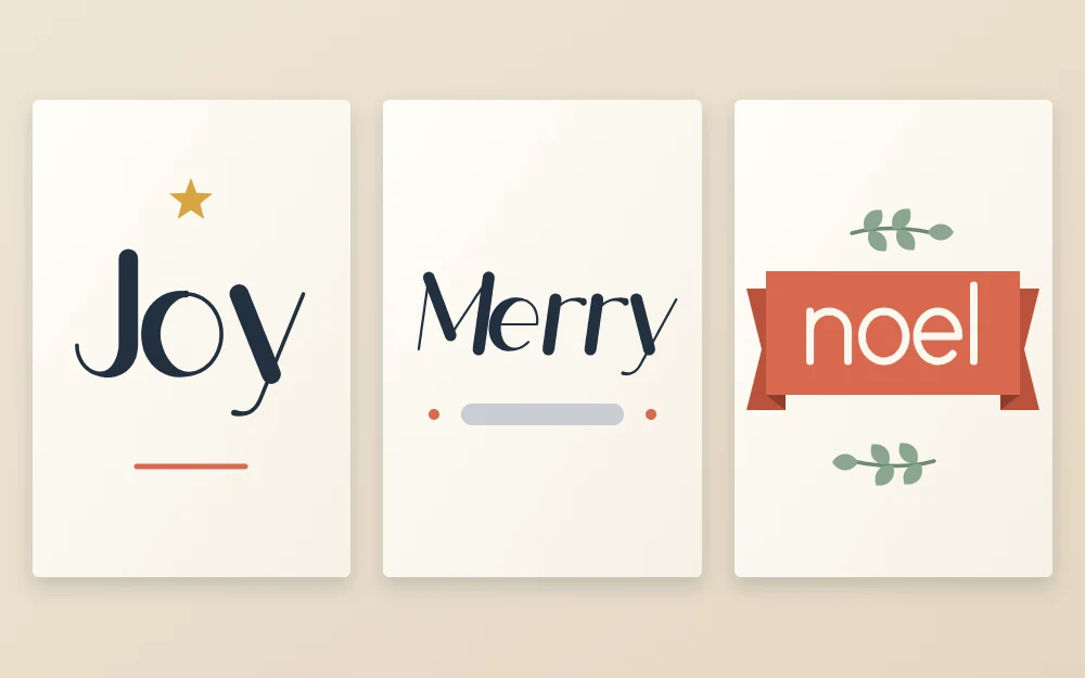
Layout 1: one big word
The word “Joy” sits large in the center of the card, with a small line such as “to you and yours” beneath it.
- Rule a baseline slightly below the middle of the card and an x-height line above it. Make the x-height generous, around 1 in (2.5 cm) on a standard card.
- Pencil the three letters, starting with the middle one on the center line so the word stays centered.
- Rule a second pair of lines well below the baseline, leaving room for the tail of the “y”, and pencil the small line in simple spaced capitals about 1/8 in (3 mm) tall.
- Check that the small line is narrower than the big word. If it is wider, shorten the wording.
Layout 2: the two-line stack
Here “Merry” is large and flowing, and “Christmas” sits below it in small, widely spaced capitals. The contrast in size and style does the design work.
- Pencil “Merry” across the upper middle of the card in a script style.
- Rule two lines for the capitals below it, about 3/16 in (5 mm) apart.
- Letter “CHRISTMAS” in plain sans serif style capitals. Begin with the middle letter, the “S”, on the center line and work outward in both directions.
- Widen the gaps between the capitals until the line is nearly as wide as the word above it.
Check that the descender of the “y” in “Merry” does not run into the capitals. Either tuck the capitals lower or let the tail fall neatly between two of them.
Layout 3: a word in a banner
A short word such as “noel” or “peace” sits inside a ribbon across the middle of the card, with a simple sprig above and below.
- Draw two gently curved parallel lines across the card, about 3/4 in (2 cm) apart, for the body of the ribbon.
- Close the ends with short vertical lines, then add a folded tail behind each end with a notch cut into it.
- Letter the word inside so that the baseline follows the lower curve.
- Add one sprig centered above the ribbon and one below.
Ribbon shapes, folds and curved baselines are explained step by step in the article on lettering banners.
Simple motifs to draw
Keep decorations small and few. Three are enough for a whole set of cards:
- Star: a tall thin cross with a shorter diagonal cross through its center, or a five-point star drawn as one continuous line.
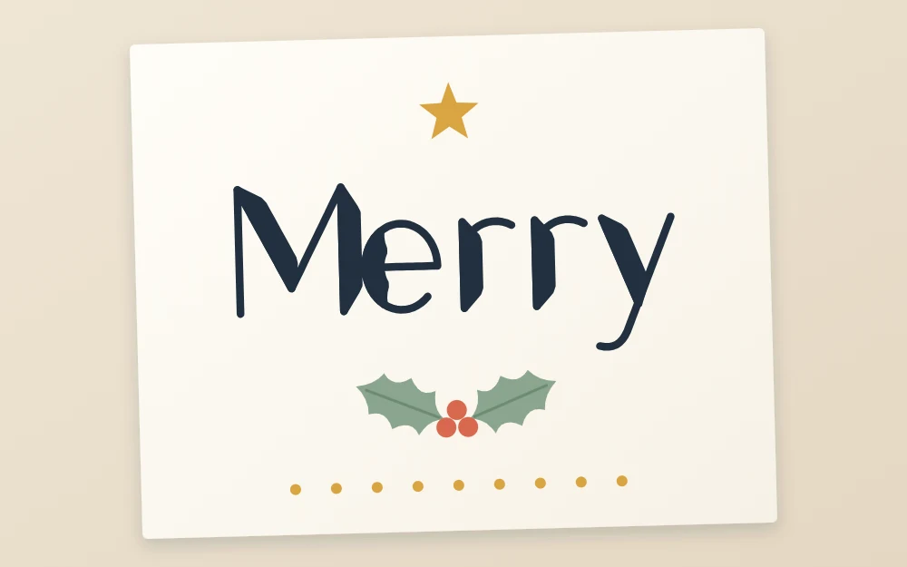
- Holly sprig: two pointed leaves with wavy edges meeting at a point, a center vein in each, and three small filled circles where they join.
- Dots: a row of evenly spaced dots under a word, or a loose scatter around it, made with the tip of a marker or a white gel pen.
Tip
Build your own motifs from simple shapes. A slightly uneven star that is yours suits a handmade card better than a perfect borrowed one.
Transfer, ink and finish
- Using your scrap plan as a reference, rule the same guide lines on the card with very light pencil pressure. Heavy lines leave grooves in cardstock that never erase.
- Pencil the lettering and motifs lightly.
- Ink the large word first, then the small lettering, then the motifs.
- Leave the card flat until the ink is fully dry. Cardstock can take noticeably longer than paper.
- Erase the pencil gently with a soft eraser.
If you are left-handed, rest your hand on a scrap sheet and ink the right side of the card first where the layout allows, so your hand stays off fresh ink.
Envelopes and the rest of the year
For the envelope, rule light pencil lines, letter the name a little larger in the same style as the card, and keep the address in plain, clear capitals so it is easy to read.
The same three layouts work for any occasion once you change the word and the motif. You will find word lists and motifs for other times of year in the collection of seasonal hand lettering ideas.
Frequently asked questions
What pens work best on Christmas cards?
It depends on the card surface. Fineliners and bullet-tip markers generally behave well on smooth, uncoated cardstock. Glossy card can cause slow drying and smearing, and rough card breaks up fine lines. Test every pen on an offcut or the back of a card and check drying time and show-through first.
How do I center a word on a card?
Mark the vertical center of the card with a faint pencil line. Count the letters, find the middle one, and pencil it on the center line. Then add letters outward to the left and right. Wide and narrow letters shift the balance slightly, so adjust by eye before inking.
What should I write on a hand lettered Christmas card?
Short greetings are easiest to letter well and leave room for breathing space. Single words such as joy, peace, noel or merry work nicely, as do two-line greetings with one large word and one small line. Save longer personal messages for ordinary handwriting inside the card.