Faux Calligraphy: How to Fake Brush Lettering With Any Pen
A three-step method for getting thick-and-thin letters from an ordinary pen: write the word, add a second line beside every downstroke, then fill it in. Includes how to find downstrokes and keep widths even.
Lesson at a glance
What you need
- HB pencil
- Soft eraser
- Ruler
- Fineliner pen
- Smooth printer paper
Faux calligraphy gives you the thick-and-thin look of brush lettering without a brush pen. You write a word with an ordinary pen, then draw the thick parts in by hand. Any tool that makes a line will do, including a fineliner, a gel pen, a pencil or a stick of chalk.
The method has three steps and one rule to remember: only the downstrokes get thick. Once you can find the downstrokes in a word, the rest is careful drawing.
What you need
- An HB pencil and a soft eraser
- A ruler for guide lines
- A fineliner or gel pen
- Smooth printer paper or a dot grid pad
Rule a baseline and an x-height line about 1/2 in (1.3 cm) apart, with room above for ascenders and below for descenders. Working fairly large makes the thick strokes easier to draw neatly.
The three-step method
Step 1: Write the word with extra space
Sketch your word in pencil as a simple even-line script or as plain print letters. Either works, although connected letters look closest to brush lettering. If you do not have a script yet, the guide to monoline lettering shows how to build one, and you can also use a simple alphabet of your own.
Leave more room between letters than feels natural, roughly one extra stroke-width per gap. The thick strokes you add later take up space, and a word that starts out snug ends up cramped.
Check: the letters sit on the guide lines, and you could fit a second line beside every stem without touching the next letter.
Step 2: Add a second line beside every downstroke
A downstroke is any part of a letter where your pen traveled down the page, toward you. For each one, draw a second line beside the first and join it smoothly at the top and bottom, so the two lines enclose a long, narrow shape.
A few decisions keep the result tidy:
- Choose a side and stay on it. On straight stems, add the line on the same side every time, for example always to the right.
- On curves, add it to the inside or the outside, not both. Many people find the outside of an oval easier, because it keeps the counter open.
- Taper the ends. Where a downstroke turns into an upstroke, let the second line curve in and merge with the first, so the thick part swells and narrows instead of ending in a square step.
Check: every thick shape is closed, and no upstroke has been doubled.
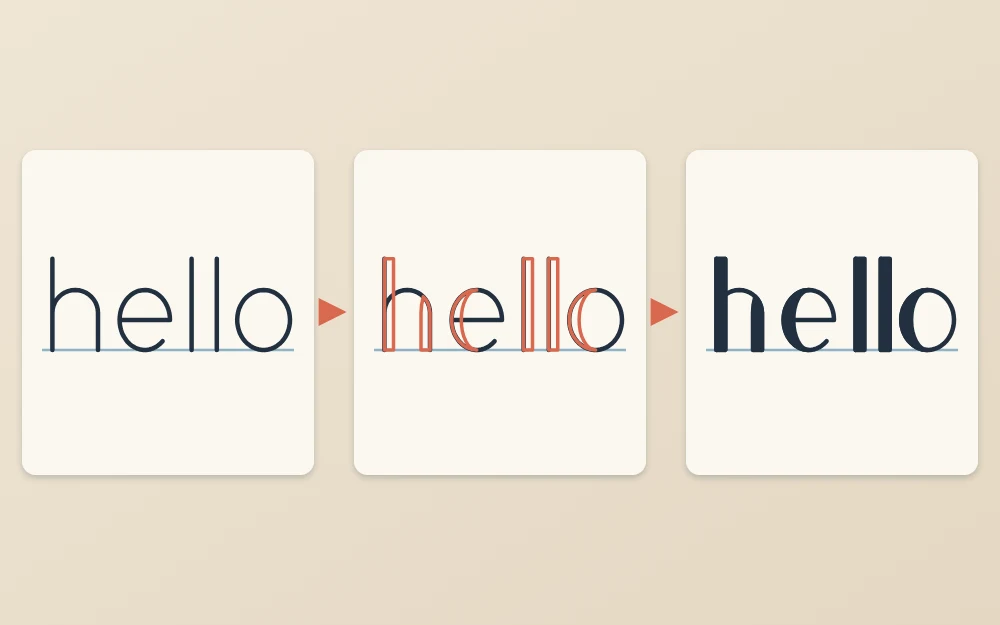
Step 3: Fill in, or leave open
Go over the pencil in ink: first the original skeleton, then the second lines. Color in the enclosed shapes with the same pen, working from the edges toward the middle. Let the ink dry completely before erasing any pencil.
If you are left-handed, fill from right to left across the word or rest your hand on a scrap sheet, since solid fills stay wet longer than single lines.
How to spot the downstrokes
This is the part that takes a little practice. The most reliable test is to trace the letter in the air, or over the sketch with a dry finger, in the order you wrote it. Each time your hand moves down, that stretch is a downstroke. Each time it moves up or sideways, it is not.
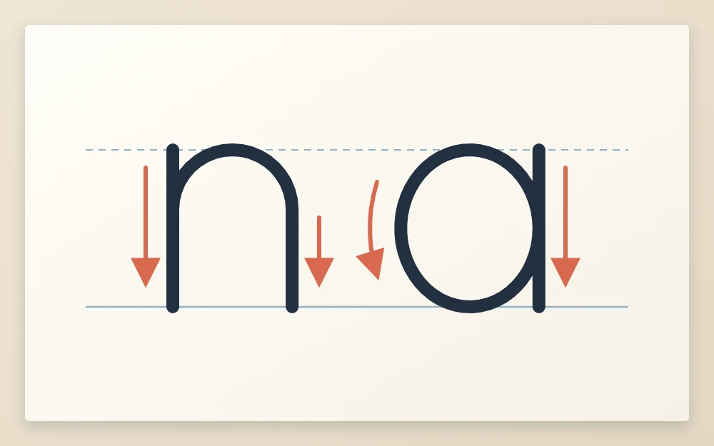
Some examples to work through:
- n: two downstrokes, the first stem and the right-hand leg after the arch. The arch climbing over the top stays thin.
- a: the left side of the oval, where the pen comes down, and the stem on the right. The right side of the oval, where the pen climbs back up, stays thin.
- o: the left side only.
- l with a loop: thin on the way up, thick on the straight way down.
- t: the stem is thick, the crossbar is thin. Horizontal strokes are never thickened.
Common mistake
Thickening the joins between letters. The little connecting strokes travel upward, so they stay thin. If a whole word looks heavy and blobby, doubled upstrokes are the usual reason.
Keep the thick parts the same width
Uneven thick strokes are what make faux calligraphy look homemade. Decide on a width before you start, about three to four times the thickness of your pen line for a medium contrast, and hold every downstroke to it.
Mark that width with two small ticks on the edge of a scrap of paper and hold it against a few stems as you go. On curves, the thick part reaches full width in the middle of the downstroke and narrows to nothing at both ends.
Tip
Finish all the second lines in pencil before inking anything. It is much easier to compare widths, and fix one, across a whole word of pencil outlines.
Decorative fills
The enclosed shapes do not have to be solid. Each of these changes the mood while the method stays the same.
- Solid: the classic look, closest to real brush lettering.
- Left open: skip the fill for a lighter, outlined effect. Your lines need to be clean, because nothing covers them.
- Striped: fill each shape with short, evenly spaced horizontal lines.
- A second color: ink the letters in a dark pen and fill the thick parts with a lighter marker.
Where faux calligraphy works well
Because it needs no flexible tip, the method goes anywhere a line can be drawn.
- Chalkboards: chalk has no thin-and-thick of its own, so drawn downstrokes are the standard way to get contrast. Sketch lightly and wipe mistakes with a damp cloth.
- Cards and gift tags: pencil lightly on smooth cardstock, then ink with a fineliner.
- Envelopes: letter the name large in faux calligraphy and write the address in small plain capitals so it stays easy to read.
Practice, and the step after
Repeat the three steps with short words that have plenty of stems, such as “hello”, “minimum” and “lovely”. Expect the first few to look uneven. Even widths and smooth tapers come gradually with repetition.
Faux calligraphy also trains your eye for a brush pen, since the thick strokes fall in exactly the same places. When you are ready to make them in a single pass with a flexible tip, read the guide to pen pressure in brush lettering.
Frequently asked questions
What is the difference between faux calligraphy and real calligraphy?
In calligraphy and brush lettering, the tool makes thick and thin strokes in a single pass as you write. In faux calligraphy, you write with an even line first and then draw the thick parts by adding a second line and filling it in. The result looks similar, but it is built in stages.
Which strokes do I thicken in faux calligraphy?
Only the downstrokes, meaning every part of a letter where the pen moved down the page. Upstrokes, horizontal crossbars and the connecting strokes between letters stay thin. If you are unsure about a letter, trace it in the air in the order you wrote it and notice where your hand moves downward.
Can I do faux calligraphy with print letters instead of cursive?
Yes. The same rule applies to separate print letters: find the strokes drawn downward and thicken them. Connected script looks closer to brush lettering, but thickened print letters give a clear, bold result and can be easier to read on signs, labels and envelopes.