Hand Lettering Layouts: 8 Simple Layout Shapes for Quotes
Eight beginner-friendly layout shapes for quotes, cards and signs, from the centered stack to the badge, with advice on blocking each one in rectangles and matching it to the length of your phrase.
You have a quote you like and a blank card, and the hard part turns out to be neither the letters nor the pen. It is deciding where the words go. Hand lettering layouts solve that problem: a layout is simply the overall shape the lines of words make together.
Below are eight shapes that suit beginners, with a note on when each one works and where it tends to go wrong. None of them needs special tools. A pencil, a ruler and, for two of them, a round object to draw around are enough.
Block the layout with rectangles first
Before any letters, draw each line of the phrase as a plain rectangle. A long rectangle stands for a long line, a tall one for a large word. Shade the rectangles gray so you see the layout as a set of shapes, not as text.
This takes seconds and tells you most of what you need to know: whether the block is balanced, whether one line is awkwardly short and whether the shape fits the paper. Deciding which words deserve the big rectangles is a separate job, covered in the guide to arranging the words of a phrase.
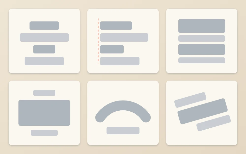
Three stacked layouts
1. Centered stack
Every line sits on a shared vertical center line, and the lines can be different widths. This is the most forgiving layout and suits almost any short quote, card or sign. Rule the center line first and build each word outward from its middle letter. It looks best when long and short lines alternate, so the outline moves in and out instead of forming a slope.
2. Left-aligned stack
All lines start at the same left edge and end wherever they end. Rule one vertical line and begin every line against it. This layout is calm and easy to read, which makes it a good choice for longer quotes, lists and recipe-style cards. Watch the right edge: if one line is much longer than the rest, break it differently.
3. Justified block
Every line is stretched or squeezed to exactly the same width, so the phrase forms a solid rectangle. Rule two vertical lines for the left and right edges. A short word gets tall, wide letters with generous spacing. A long word gets shorter, narrower letters. The result looks bold and poster-like. A line with a single two-letter word is very hard to stretch, so combine it with a neighbor.
Two layouts with one clear focus
4. Big word in the middle
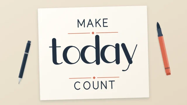
One important word is lettered large across the center, with a small line above and a small line below. Think of “make / today / count”, with “today” filling most of the space. Use it when a phrase has one obvious key word. Keep the small lines noticeably small, about a third of the height of the big word, or the contrast disappears.
5. Arch over a straight line
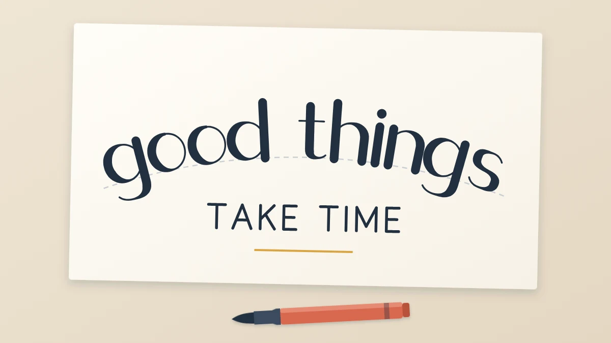
The first line curves upward in an arch and the second sits straight beneath it, as in “good things” arched above “take time”. Draw the arch by tracing around a plate or bowl, or with a compass, then draw a second arc above it at the height of your letters. The two arcs act as baseline and top line.
Keep the stems of the letters pointing away from the center of the circle, like spokes, and keep the arch shallow. A steep arch tips the first and last letters onto their sides. This layout suits two-line phrases, greetings and titles.
Three layouts with movement or shape
6. Diagonal or slanted baseline
Every baseline climbs from lower left to upper right at the same angle. Rule the first baseline with a ruler, then rule the others parallel to it. A gentle rise, about 1/2 in (1.3 cm) over the width of a small card, adds energy without hurting legibility. It suits short, lively phrases of two or three lines. Mixed angles look accidental, so keep them identical.
7. Circle or badge
The whole phrase sits inside a circle. Usually one line arches along the top inside edge, one line runs straight across the middle and, sometimes, one curves along the bottom. Draw the circle around a round object, then add a smaller circle inside it to mark the inner limit of the curved words. It fits tags, coasters and labels.
8. Words inside a simple shape
Draw a light outline of a heart, a house, a leaf or a mug, and fit the lines of words inside so that their ends follow the edge. Wide parts of the shape take long lines and narrow parts take short ones. Erase the outline at the end and the words still suggest the shape. Choose shapes with simple, bulging outlines. Anything with thin arms or sharp points leaves no room for letters.
Match the layout to the length of the phrase
The number of words narrows the choice quickly. Use this as a starting point, not a rule.
| Phrase length | Layouts that suit it | Why |
|---|---|---|
| 1 to 3 words | Big word in the middle, arch over a straight line, diagonal | Few words leave room for large letters and a strong shape |
| 4 to 7 words | Centered stack, justified block, circle or badge | Enough lines to build a solid block |
| 8 to 15 words | Left-aligned stack, centered stack, words inside a shape | Many lines need a calm, readable structure |
Filling the gaps a layout leaves
Most layouts leave small empty areas, especially beside short lines. Often the best answer is to leave them alone. White space gives the words room.
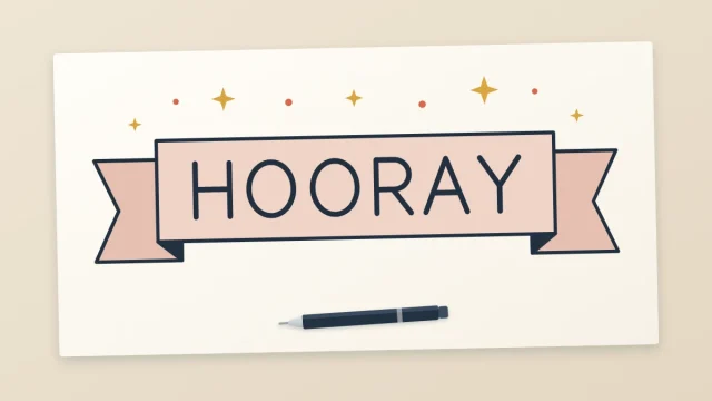
When a gap does look like a hole, fill it with something quiet: a short ruled line on each side of a small word, a row of three dots, or a ribbon behind one line (see drawing banners and ribbons). A curved stroke under the last word can also close the bottom of a centered stack; the article on easy swashes and flourishes shows how to add one without tangling the letters.
A quick check before you commit
- Squint. The block should read as one shape with clean edges.
- Read it in order. The eye should travel top to bottom without jumping.
- Measure the margins. Leave similar space on all sides of the block.
Layouts become easier to choose the more of them you block out. Start with the centered stack, then try a new shape whenever a phrase seems to ask for one.
Frequently asked questions
What is the easiest lettering layout for a beginner?
The centered stack. Each line is centered on one vertical pencil line and the lines can be different widths, so small errors in letter size do not spoil the shape. Once that feels comfortable, the big-word-in-the-middle layout is a natural next step because it uses the same center line.
How do I letter words on a curve?
Draw two parallel arcs with a compass or around a round object, one for the baseline and one for the top of the letters. Sketch the middle letter at the top of the arch first and work outward. Keep each stem pointing away from the center of the circle and keep the curve shallow.
How do I choose a layout for a long quote?
Long quotes need calm structure more than a clever shape. A left-aligned or centered stack with even line lengths is the most readable choice. Pick one or two words to emphasize with size or weight and keep the rest in a single plain style so the block stays easy to read.