Lettering Composition: How to Arrange Words in a Phrase
A repeatable six-step process for turning a short phrase into a balanced lettered piece: choose the important words, break the lines, sketch thumbnails, set contrast, rule a frame and check the white space.
Lesson at a glance
What you need
- HB or 2B pencil
- Soft eraser
- Ruler
- Two sheets of smooth paper
- Fineliner pen (optional)
A single word forgives a lot. A phrase does not: as soon as you letter four or five words together, you have to decide which ones are large, where the lines break and how the whole block sits on the page. That set of decisions is lettering composition, and it is a process you can repeat rather than a talent you either have or lack.
The method below works for any short phrase of roughly three to eight words. The examples are “make today count” and “be kind”. Everything happens in pencil first, and ink comes last, if at all.
What you need
- An HB or 2B pencil and a soft eraser
- A ruler
- Two sheets of smooth paper: one for small sketches, one for the full-size piece
- A fineliner, only if you want to ink the result
Set aside about 30 to 45 minutes for a first attempt.
Step 1: Pick the important words and break the lines
Read the phrase aloud and notice which words carry the meaning. In “make today count” the weight falls on “today”. In “be kind” it falls on “kind”. Underline two or three words at most. If you underline everything, nothing stands out.
Next, write the phrase in plain handwriting, breaking it where you would naturally pause when speaking:
- make
- today
- count
Good line breaks keep words that belong together on the same line. Avoid ending a line on a small connecting word such as “and”, “the” or “of” when it could start the next line or sit on a tiny line of its own. Check: read the lines top to bottom. If the rhythm sounds odd, move the break.
Step 2: Make thumbnail sketches
A thumbnail is a tiny plan, about 1 1/2 in (4 cm) wide. Draw four small frames in a row. In each one, do not write letters. Draw a gray block for each word instead: a tall, wide block for an important word, a short, narrow block for a small one.
Change one thing in every frame. Put the big block in the middle, then at the bottom. Try three lines, then two. A thumbnail is quick, so a weak idea costs you almost nothing.
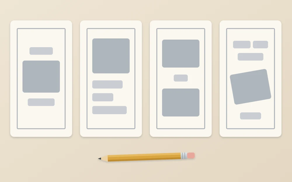
Pick the frame where the block as a whole looks like one solid shape with clear edges. If you want more shapes to test, the guide to simple layout shapes for quotes lists eight of them. Check: squint at your chosen thumbnail. The important word should be the first thing you see.
Step 3: Give each word a size and a style
Now decide how the contrast is made. You have three simple tools:
- Size. Make important words two to three times taller than the small words.
- Style. Set the important word in a different style, such as a flowing script against plain monoline capitals.
- Weight. Draw the important word with thicker strokes.
Keep small words small. “And”, “the”, “of”, “to” and “a” rarely deserve attention, and shrinking them frees room for the words that do.
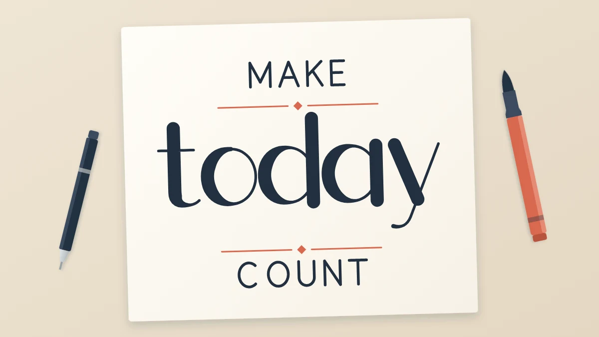
Limit the piece to two or three styles. In the example, “make” and “count” are small monoline capitals and “today” is a large script word. Two styles, one clear hierarchy.
Common mistake
Giving every line its own style. Five styles in five lines reads as five separate pieces. If the composition feels busy, remove a style before you change anything else.
Step 4: Draw a frame and a center line
On the clean sheet, rule a light frame in the same proportions as your thumbnail. A frame about 5 in (13 cm) wide is comfortable for a first piece. The frame is the outer limit of the lettering, not a border you will keep.
Measure the width, mark the middle at the top and bottom, and rule a vertical center line. Then rule horizontal guide lines for each line of words: a baseline and a top line per row, tall for the important word and short for the small ones. Leave a gap between rows of about half the height of your small letters.
Check: the rows together should fill the frame from top to bottom with even gaps. Adjust the guide lines now, while they are only pencil.
Step 5: Sketch the words at full size
Work lightly. For each line, count the letters and find the middle one, including spaces. Place that middle letter on the center line, then build outward to the left and right. This centers the word far more reliably than starting at the left edge and hoping it ends in the right place.
Sketch thin skeletons first and add weight only when every word fits. The article on taking a pencil sketch through to final ink covers the refining stages in detail.
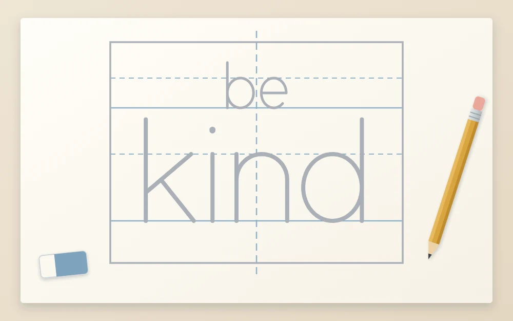
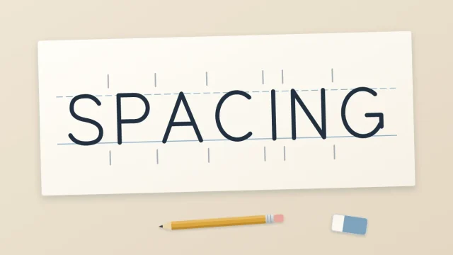
Check: each line should reach about the same distance from the center line on both sides. If a word runs past the frame, narrow its letters or tighten the gaps between them. The guide to spacing letters and words explains how to do that without making the word look cramped.
Step 6: Check balance and white space
Prop the sheet up and step back, or turn it upside down. Upside down, you stop reading and start seeing shapes. Look for three things:
- Balance. Does one side look heavier? A long descender or a wide capital can pull the block to one side. Shift the line slightly to compensate.
- Gaps between rows. They should look equal. Ascenders and descenders that collide need a little more room or a nudge sideways.
- Outer margin. Leave clear space around the block, at least as wide as the height of your largest letters.
If a gap bothers you, a thin ruled line on each side of a small word fills it quietly. Or place one short line inside a ribbon; see how to draw a banner for a word.
Tip
If you ink the piece, start with the largest word and let each line dry before moving on. Left-handed readers can ink from the right side toward the left, or rest the hand on a scrap sheet, to avoid dragging through wet lines.
Repeat it with a new phrase
The same six steps work for any phrase. To practice, take one phrase and make three full-size compositions from three different thumbnails. Then switch which word is emphasized and see how the meaning shifts.
Early compositions tend to look stiff, and that is normal. Judgment about balance builds gradually, piece by piece.
Frequently asked questions
How many lettering styles should I use in one composition?
Two is a safe number for a beginner piece and three is a sensible upper limit. Use one style for the words you want to stand out and a quieter one for everything else. More styles than that usually make the piece look like separate fragments instead of one design.
How do I center a word without measuring every letter?
Count the letters and spaces in the line, find the middle character and sketch it on your vertical center line. Then add letters outward in both directions. Wide letters such as m and w and narrow ones such as i shift the result a little, so adjust by eye afterward.
What size should thumbnail sketches be?
Small enough that you cannot fuss over details, roughly the size of a large postage stamp or a little bigger. At that size you draw blocks rather than letters, which keeps your attention on the arrangement. Make several, since the point is to compare options quickly.