Letter Spacing in Hand Lettering: How to Space Letters and Words
Learn to space letters by the look of the white space instead of by distance, handle awkward pairs such as A, T and V, and set word and line spacing.
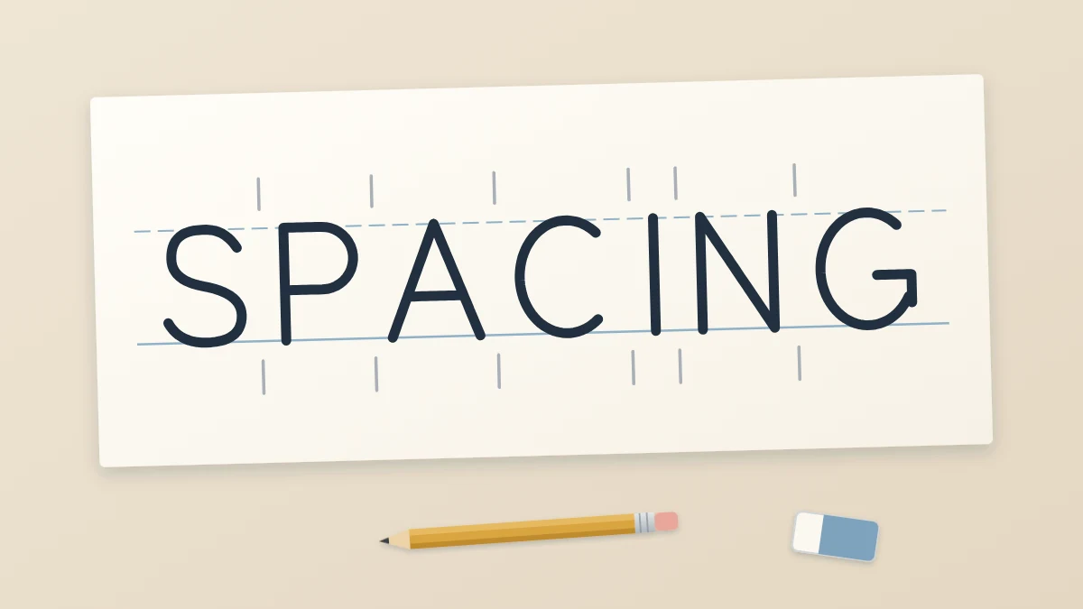
You measure the gaps in a word with a ruler, make every one identical, and the result looks wrong: a hole in one place, a traffic jam in another. Nothing is the matter with your ruler. Letters are different shapes, and equal distances between different shapes do not look equal.
Good letter spacing is judged by eye, and the rule behind it is short: the white space between letters should look equal in area, not in distance. Once you can see that white space as a shape of its own, most gappy and cramped words become fixable.
Area, not distance
Picture pouring sand into the gap between two letters until it fills up to the top guide line. Evenly spaced letters would each need about the same amount of sand. Two straight stems side by side form a simple rectangle of space. Two round letters curve away from each other at the top and bottom, so the gap between them holds extra space in its corners. To keep the amount equal, the round letters have to move closer.
The space inside letters matters too. The counter of an “o” or the opening of an “n” sets the scale: gaps between letters that are much larger than the spaces inside them make a word fall apart, and much smaller ones make it clog.
The three pair types
Almost every pair of neighboring letters falls into one of three groups, depending on the edges that face each other. Learn the order and you can space most words without thinking about each pair from scratch.
| Facing edges | Examples | Gap at the closest point |
|---|---|---|
| Straight next to straight | H I, n i, l l | Widest. Set this first and use it as your reference. |
| Straight next to round | H O, n o, d i | A little narrower than the reference. |
| Round next to round | O C, o e, b o | Narrowest. The curves nearly touch. |
Begin a word by deciding the straight-to-straight gap, since it is the easiest to see. Then every other gap is that amount, reduced to suit the shapes. The names of the parts involved, such as stem, bowl and counter, are explained in the guide to letter anatomy.
Awkward letters with open sides
Some letters carry empty space inside their own outline. Capital A, V, W and Y slope away from their neighbors. T has open space under its crossbar on both sides, and L has open space above its foot. In lowercase, r and t leave a gap at the upper right, and f, k, v, w and y behave similarly.
Because that built-in space counts toward the gap, these letters must sit closer to their neighbors than feels natural. Sometimes they overlap in the vertical sense: the crossbar of a T may hang over the top of a following A, and the foot of an L may slide under the arm of a T.
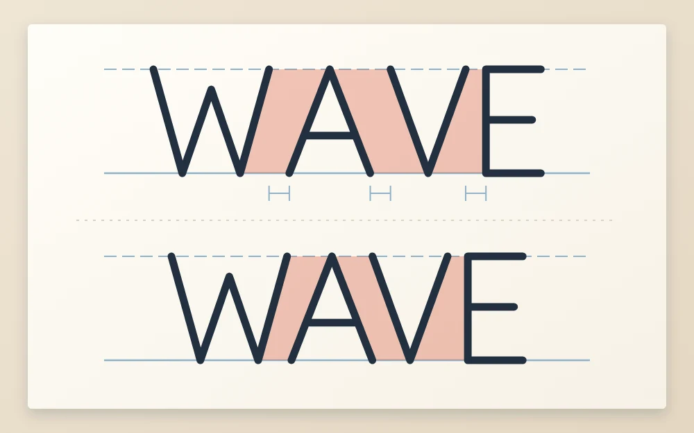
In “WAVE”, the diagonals of W, A and V run parallel to each other, so those letters can sit very close. The V and E meet as a slope facing a straight stem, which leaves a wedge of space at the top; the E moves in to make up for it. Type designers call this pair-by-pair adjustment kerning. In hand lettering you simply do it as you sketch.
Common mistake
Fixing a tight spot by spreading only the two letters involved. That usually creates a new hole. If one pair cannot get any closer, open up all the other gaps slightly to match it.
Space between words
A word space should be clearly bigger than a letter gap and no bigger than it needs to be. A reliable starting size is the width of a lowercase “o” or “n” in the style you are using. For all-capital lettering, about the width of an N is a reasonable guide.
Space between lines
Lines need enough room that the descenders of one line do not collide with the ascenders of the next. A workable beginner setting is a gap between the descender line of one row and the top line of the next that is roughly equal to the x-height. Lettering in capitals only has no descenders, so its lines can sit closer, with a gap of about half the cap height.
Keep the hierarchy clear: letter gaps smallest, word spaces larger, line gaps larger again. When the space between lines is smaller than the space between words, the eye starts reading down the page instead of across. How to arrange whole lines within a piece is a separate subject, covered in the guide to lettering composition.
Three quick checks
Do these in pencil, before any ink goes down.
- Squint. Half close your eyes until the letters blur into a gray band. Dark clumps show where letters crowd, and pale patches show holes.
- Flip the page. Turn the sheet upside down. You stop reading the word and start seeing shapes and spaces.
- Three letters at a time. Cover everything except the first three letters with two scraps of paper. Ask whether the middle letter looks centered between its neighbors. Slide along one letter and ask again, to the end of the word.
How to fix a word that is already sketched
Lightly shade the gaps with the side of your pencil so you can compare them as shapes. Find the tightest pair that cannot be loosened, and treat it as the standard. Then erase and redraw the other letters to match, working outward from that pair. A sheet of tracing paper laid over your own sketch makes this quicker: redraw the word on the overlay, nudging each letter left or right as you go.
If you are left-handed, shade and adjust from the right end of the word toward the left, so your hand does not smear the pencil you have just laid down.
Spacing is one part of an even word
Even gaps cannot rescue letters that change height or lean at different angles, and regular letters still look restless when the gaps vary. If your spacing passes the three checks and the word still seems unsettled, work through the guide to keeping size, slant and weight even.
Expect your eye to improve slowly. At first you will spot only the worst gap in a word. With regular practice you begin to notice smaller differences, and eventually you place letters well on the first sketch more often than not.
Frequently asked questions
Should I measure the gaps between letters with a ruler?
A ruler is useful for guide lines but misleading for gaps. Equal distances look uneven because letters have different edges: straight, round, slanted or open. Use a ruler to set one reference gap between two straight stems if you like, then adjust every other gap by eye until the white spaces look alike.
How much space should I leave between words?
Roughly the width of a lowercase o or n in the style and size you are lettering. That is wide enough to separate words clearly without leaving rivers of white. If your letters are spaced far apart for effect, widen the word spaces in proportion so the words stay distinct.
Why do letters like A, V and T always leave big gaps?
Their outlines include empty space: diagonals lean away from neighbors, and a T has open room under its crossbar. That built-in space adds to the gap. Move these letters closer than seems right, even letting one tuck under or over the next, until the spaces look balanced with the others in the word.