Seasonal Hand Lettering Ideas: Words and Motifs for Every Season
Small lettering projects for spring, summer, fall and winter, each with a word list, a suggested style, one simple motif to draw and a color idea.
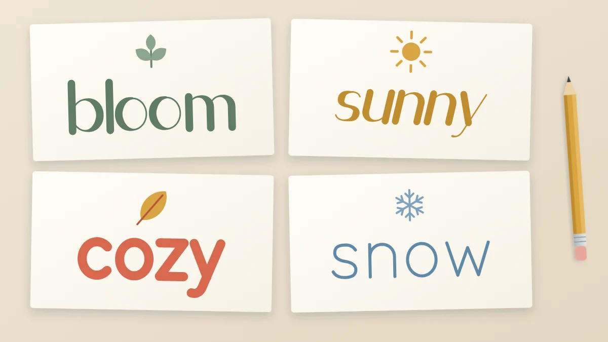
Practice is easier to keep up when it ends in something you can use this week: a gift tag, a place card, a header in your planner. Seasonal hand lettering gives you a steady supply of those small projects, and a reason to come back to the same skills every few months with fresh words.
The ideas below are grouped by season. Each group has a short word list, a style that suits the mood, one simple motif and a color suggestion. Nothing here needs more than a pencil, a pen or two and a small piece of paper.
The four seasons at a glance
| Season | Words | Style | Motif |
|---|---|---|---|
| Spring | bloom, fresh, grow | Light monoline script | Sprig of leaves |
| Summer | sunshine, wander, sunny | Bold block capitals | Sun with rays |
| Fall | cozy, gather, thankful | Serif-inspired capitals | Leaf and acorn |
| Winter | joy, peace, snow | Faux calligraphy or brush script | Star or snowflake |
Treat the pairings as starting points; any word can be drawn in any style.
Spring: bloom, fresh, grow
Spring words suit thin, open letters with plenty of air around them. Try a monoline script: one line weight, rounded shapes and a gentle slant, drawn with a fineliner or gel pen. Leave slightly more space between letters than you normally would.
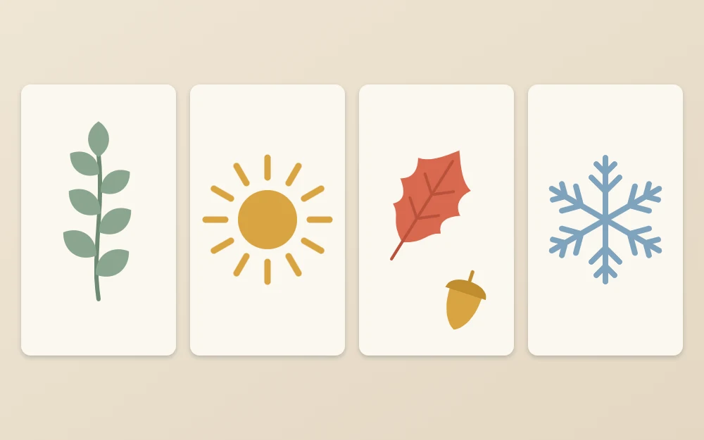
Motif: a sprig of leaves. Draw one gently curved stem. Add pairs of small pointed ovals along it, each starting at the stem and leaning toward the tip, with a single leaf at the end. Five to seven leaves are enough.
Color: a fresh green with one soft accent such as pink or pale yellow. Let the white of the paper do most of the work.
Summer: sunshine, wander, sunny
Summer calls for weight and confidence. Thick capitals with even strokes carry short words like “SUNNY” well, and they leave room inside the letters for stripes or a solid fill. The block lettering tutorial walks through building them from a skeleton.
Motif: a sun with rays. Draw a circle or a half circle resting on a line. Add short straight rays around it, alternating one long and one short, without letting them touch the circle. A half sun placed under a word works as an underline.
Color: warm yellow or orange against a single cool color such as teal. Two strong colors are plenty.
Fall: cozy, gather, thankful
Fall words have a settled, traditional feel that suits letters with small feet at the ends of the strokes. Draw plain capitals first, then add a short serif to the end of each stem. Longer words such as “thankful” look good in capitals with wide spacing; “cozy” is short enough to draw large.
Motif: a leaf and an acorn. For the leaf, draw a center vein, then a pointed outline around it with two or three shallow notches on each side. For the acorn, draw an oval that comes to a soft point at the bottom, then cover its top third with a rounded cap and a short stalk. Cross-hatch the cap lightly.
Color: rust, mustard and brown, with dark gray lettering instead of pure black for a softer look.
Winter: joy, peace, snow
Winter is the season for contrast: thick downstrokes and thin upstrokes. With a brush pen, the flexible tip gives you that contrast through pressure. With a fineliner, draw the word as a thin skeleton and thicken every downstroke by hand. Short words like “joy” and “snow” are forgiving, because there are few joins to manage.
Motif: a star or a six-armed snowflake. For the snowflake, draw one vertical line, then two diagonal lines through its center so that six arms are spaced evenly. Add a small “v” near the tip of each arm. Draw several in different sizes instead of one large one.
Color: deep blue or green with white gel pen details, or classic red and green. If cards are your winter project, the guide to hand lettered Christmas cards has three complete layouts.
Five small projects that work in any season
- Cards: one large word on the front, with a motif above or below it.
- Gift tags: a single short word or a name. On a tag about 2 in (5 cm) wide, three to five letters is the comfortable limit.
- Place cards: a first name in your seasonal style with one tiny motif at the end.
- A seasonal sign: a two- or three-word phrase on a larger sheet to stand on a shelf.
- Planner headers: the month name or a seasonal word at the top of a page.
Tags and place cards are good first projects because the area is small and the lettering is over quickly. A sign needs more planning: decide which word is most important, make it the largest and arrange the others around it. The principles in the article on lettering composition will help with that.
Tip
Pencil the word first and add the motif second, in whatever space is left. A motif drawn first tends to push the lettering off center.
Keep motifs simple and your own
A motif supports the word; it should never compete with it. Three guidelines keep things in proportion:
- Make the motif smaller than the x-height of the main word.
- Use the same pen for the motif and the lettering so the line weights match.
- Repeat one motif instead of mixing several.
Build motifs from basic shapes you draw yourself, such as ovals, straight lines and dots. They will match your letters because the same hand made both.
When a word feels bare even with a motif, a single extended stroke often does more than extra drawings. An underline swash or a long exit stroke from the guide to simple lettering flourishes fills empty space gracefully.
For color, limit each piece to one dark color for the lettering and one or two accents for the motif or a single highlighted word.
Common mistake
Lettering in a pale color such as yellow or light pink. Light words vanish from a short distance. Keep pale colors for fills and motifs, and letter in something dark.
Make it a habit
At the start of each season, pick three words from the list and letter each one small, on a tag or a scrap card. Date them and keep them together. Left-handed letterers should let each word dry before adding the motif beside it, or place a scrap sheet under the hand.
After a full year you will have a dozen small pieces in four styles. Lay them out in order and you will see, gradually and honestly, how your lines and spacing have changed.
Frequently asked questions
What are good words to hand letter for each season?
Short, familiar words work best. For spring, try bloom, fresh or grow. For summer, sunshine, wander or sunny. For fall, cozy, gather or thankful. For winter, joy, peace or snow. Words of three to eight letters fit comfortably on tags and cards and give you a mix of straight and round shapes.
What can I make with seasonal lettering as a beginner?
Start with small items such as gift tags, place cards and planner headers, where one short word is enough. Greeting cards are a natural next step. A larger sign with a short phrase takes more planning, so it is better saved until single words feel comfortable.
How many colors should I use in a seasonal lettering piece?
Two or three is usually enough: one dark color for the lettering so it stays readable, plus one or two accent colors for the motif or a small detail. Test them together on the actual paper first, because colored or cream stock changes how ink looks.