Simple Lettering Flourishes: Easy Swashes for Beginners
Five easy flourishes that grow out of strokes your word already has, plus four rules and a short warm-up that keep swashes smooth, balanced and readable.

Lesson at a glance
What you need
- HB pencil
- Soft eraser
- Ruler
- Small firm-tip brush pen
- Fineliner pen
A flourish looks like decoration added on top of a word, which is why so many first attempts end in a tangle. In practice, good lettering flourishes are not added at all. They are strokes the word already has, allowed to travel a little farther.
That idea keeps things manageable. You do not need to invent loops out of thin air; you only need to find the strokes that can be extended and decide which one or two deserve it.
What you need
- HB pencil and a soft eraser
- Smooth printer paper or marker paper with ruled guide lines
- A small firm-tip brush pen, or a fineliner if you prefer to draw your thick strokes
Flourishes work with either tool. With a brush pen, the flexible tip makes downstrokes thick when you press and upstrokes thin when you lighten. A fineliner makes one line weight, so you draw the word as a skeleton and thicken the downstrokes afterward, as described in the guide to faux calligraphy. The flourish rules below are the same for both.
Warm up with ovals and figure eights
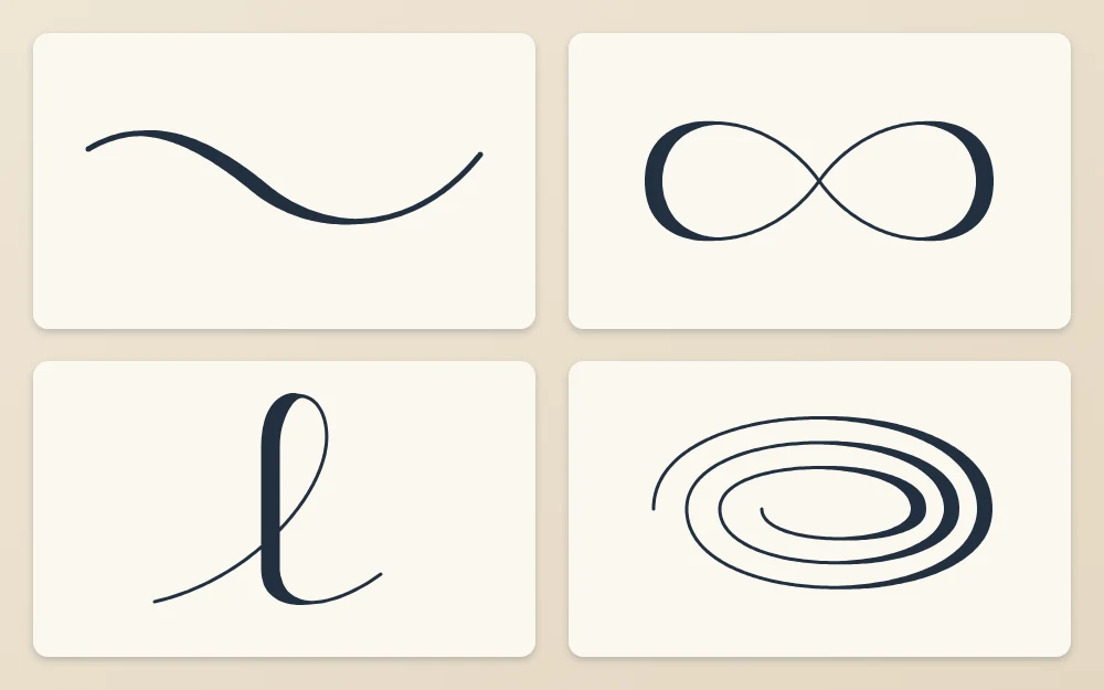
Every flourish is made from parts of two shapes: the oval and the horizontal figure eight. A few minutes on these before you letter makes a visible difference.
- Draw a row of ovals about 1 in (2.5 cm) wide, each one wider than it is tall and leaning slightly to the right. Move from the shoulder and elbow, not the fingers.
- Draw a row of figure eights lying on their sides. Cross in the middle at a shallow angle and keep both halves the same size.
- Draw an oval spiral: start with a large oval and wind inward two turns without touching the previous line.
Check each row for flat spots and sudden corners. If you see them, slow down and make the shape larger. More warm-ups of this kind are collected in the set of lettering practice drills.
Five flourishes that grow out of existing strokes
The exit stroke
The last letter of a script word ends in a thin upstroke. Instead of stopping at the x-height line, let it continue up and to the right in a shallow curve about as long as two letters, then fade out. This is the easiest flourish and the best one to learn first.
The entry stroke
The first letter can begin with a matching lead-in. Start below the baseline to the left of the word, sweep up in a shallow curve and flow into the first downstroke. Keep it thin all the way.
The extended crossbar
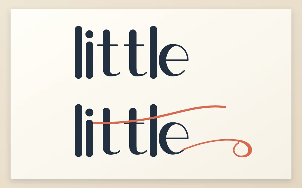
The crossbar on a “t” is a ready-made flourish. Draw it last, begin well to the left of the stem, and let it run past the end of the word with a gentle wave: slightly down, then slightly up. In a word with two “t”s, such as “little”, one long bar can cross both.
The looped ascender or descender
The ascending loop on “l”, “h” or “k” and the descending loop on “g” or “y” can be made larger and more open. Widen the loop into a leaning oval rather than making it taller, so it does not collide with the line above or below.
The underline swash
From the end of the last letter, bring the stroke down below the baseline, sweep it back to the left under the word, and finish with a gentle curve. A single loop in the middle of the swash is optional. Its width should roughly match the word, so the word appears to sit on it.
Four rules that keep flourishes clean
- Ovals, not circles. Tight round loops look cramped. Stretch every curve sideways into an oval.
- Thin over thin, or thin over thick. Where two lines cross, at least one must be thin. Two thick strokes crossing make a dark blot that pulls the eye away from the word.
- Balance. A flourish on the upper right is steadied by one on the lower left. If all the extra strokes sit on one side, the word looks as if it is tipping.
- Less is more. One or two flourishes per word is plenty. The word must still be read at a glance.
Common mistake
Letting a flourish cut through the body of a letter. Crossing a stem at a clear angle is fine, but a line that runs along or through a bowl makes the letter hard to recognize.
Add a flourish to a word, step by step
- Letter the word plainly in pencil on guide lines. Fix the spacing before anything else.
- Circle the strokes that could be extended: the first stroke, the last stroke, any crossbar, any ascender or descender.
- Choose one or two, on opposite sides of the word.
- Sketch each flourish lightly, moving your whole arm. Redraw until the curve has no flat spots.
- Check the crossings. If a thick stroke meets a thick stroke, move the flourish or make that part an upstroke.
- Ink the word first, then the flourishes, each in a single steady movement. Erase the pencil when the ink is completely dry.
Tip
Draw flourishes faster than letters. A slow hand records every tremor in a long curve, while a slightly quicker, confident sweep comes out smoother. Rehearse the movement in the air above the paper once or twice first.
Left-handed letterers may find long strokes that sweep to the right awkward to push. Turning the paper a little, or drawing the underline swash from its far end back toward the word, is perfectly acceptable. Give each stroke a moment to dry before your hand passes over it.
Where flourishes fit in a layout
Flourishes need empty space to move into, so plan that space instead of squeezing a swash into whatever is left. In a multi-line piece, use them to fill the natural gaps at the ends of short lines; the article on hand lettering layouts shows how to plan those gaps.
For practice, take one short word and letter it five times, each with a different single flourish from the list above. Then try two together. Smooth curves develop gradually, so judge your progress across weeks of short sessions, not across one page.
Frequently asked questions
How many flourishes should one word have?
One or two is a good limit while you are learning. A single exit stroke or underline swash already changes the character of a word. Extra loops quickly compete with the letters, and the word becomes slower to read, which defeats the purpose of lettering it.
Can I draw flourishes without a brush pen?
Yes. Draw the flourish as a single thin line with a pencil or fineliner, then thicken only the parts where the stroke travels downward, exactly as you would for the letters. Most flourishes are largely upstrokes and sideways strokes, so they stay thin for most of their length.
Why do my flourishes look shaky?
Shaky curves usually come from drawing slowly with the fingers. Try moving from the elbow and shoulder, making the shape larger, and using a slightly quicker stroke. Rehearsing the movement above the paper before touching down also helps. Smoothness improves gradually with regular oval and figure eight practice.