Block Lettering: How to Draw Bold Block Letters Step by Step
Draw bold block capitals by building an even band around thin skeleton letters. Covers a paper-strip gauge for equal stroke thickness, round letters, tricky diagonals, inking and simple fills.
Lesson at a glance
What you need
- HB pencil
- Soft eraser
- Ruler
- Scrap paper strip
- Fineliner pen
- Bullet-tip marker
- Graph paper
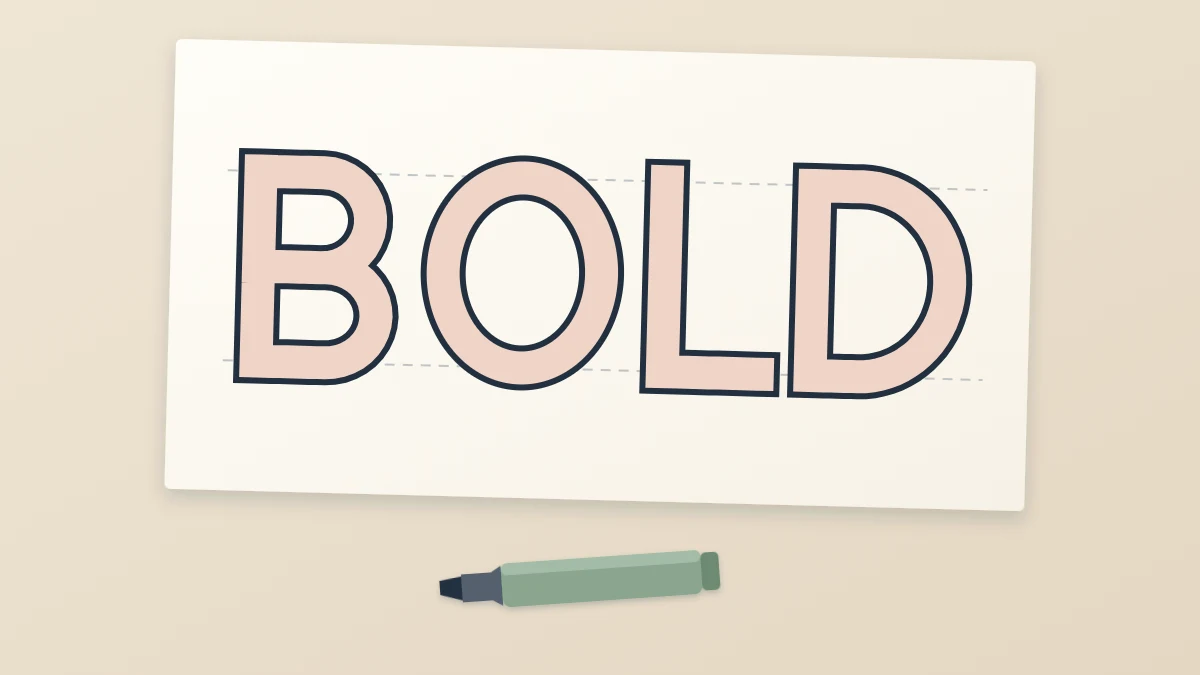
Block lettering is the bold, poster-style capital you see on signs and headings: thick strokes of even width, drawn as outlines and then filled or left open. It is hard to draw freehand, so do not.
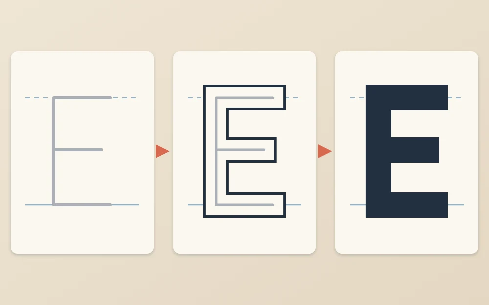
The dependable way is to start with thin skeleton capitals and build an even band around each stroke. The skeleton decides the shape and spacing, and the band adds the weight. All you need is a pencil, a ruler and some patience with the eraser.
What you need
- An HB pencil, kept sharp, and a soft eraser
- A ruler
- A narrow strip of scrap paper for a thickness gauge
- A fineliner for outlines and a bullet-tip or chisel-tip marker for fills
- Smooth printer paper, marker paper or graph paper
Step 1: Rule the lines and draw the skeleton
Rule a baseline and a cap height line about 1 1/2 in (4 cm) apart. The guide to drawing baselines and guide lines covers ruling in detail.
Decide on a stroke thickness. About 1/4 in (6 mm) suits this height. Then rule two more light lines, each half that thickness inside the first pair: 1/8 in (3 mm) below the cap height line and the same above the baseline. The skeleton sits between these inner lines, so the finished letters will reach the outer ones exactly.
Now sketch the word in thin, plain capitals with no serifs. If you want help with the proportions of plain capitals, see the guide to sans serif hand lettering. Leave generous gaps, about two stroke thicknesses between skeletons, because each letter is about to grow sideways by half a thickness on each side.
Check: skeletons touch both inner lines, verticals are upright, and the gaps look far too wide. That is correct at this stage.
Step 2: Build an even band around each stroke
Draw a line on both sides of every skeleton stroke, each half the stroke thickness away from it. The skeleton ends up running down the middle of a band.
To keep the band equal everywhere, make a paper-strip gauge. Mark two ticks on the edge of the strip exactly one stroke thickness apart, with a third tick halfway between them. Lay the middle tick on the skeleton and dot the paper at the two outer ticks. Repeat every 1/2 in (1.3 cm) or so along the stroke, then join the dots with the ruler.
- Start with the vertical stems of every letter.
- Add the horizontal strokes: the arms of E, F, L and T, and the crossbars of A and H.
- Close the open ends of strokes with a short straight line, square to the stroke.
Check: slide the gauge along several strokes. Horizontals should be as thick as verticals. Beginners tend to draw horizontals too thin.
Step 3: Tidy corners and counters
Where two bands meet, their outlines cross. Erase the short pieces of line inside the letter so that each letter becomes a single outline.
Next, look at the counters, the enclosed spaces in A, B, D, O, P and R. They shrink as strokes thicken, and they are the first thing to fill in. If a counter is narrower than about half a stroke thickness, widen the whole letter instead of thinning its strokes.
Round letters: O, C, S and their relatives
A ruler cannot help with curves, so the gauge does the work. Draw the skeleton O as a clean oval, then dot the inner and outer positions at eight or more points around it, as if marking the hours on a clock face. Join the dots with short, light strokes and turn the paper as you go.
- C and G: an O with an opening on the right. Cut the ends square to the stroke.
- D, B, P and R: build the straight stem first, then the bowl. Keep the bowl as thick as the stem.
- S: take it slowly. Dot both edges all the way along the skeleton before joining anything, and check the thickness in the diagonal middle section, where it tends to swell.
Tip
Let round letters rise a hair above the cap height line and dip a hair below the baseline. A curve touches the line at a single point, so an O drawn to exactly the same height as an H looks smaller beside it.
Tricky diagonals: A, K, M, N and W
Diagonal bands follow the same half-thickness rule, but measure the thickness square to the stroke, not horizontally. Hold the gauge at a right angle to the diagonal. Measured along the baseline, a diagonal band looks wider than a vertical stem, and that is expected.
- A and V: where the two diagonals meet, flatten the point into a short horizontal edge so it does not become a spike.
- M and W: these need to be wider than other letters, or the inner triangles close up. Redraw the skeleton wider if they do.
- N: the diagonal runs from the top of the left stem to the bottom of the right one. Let it merge into the stems at the corners.
- K: bring the upper diagonal to the stem at about mid-height, and start the lower diagonal from the upper one, not from the stem.
Step 4: Ink the outline and erase
Go over the outer outline and the counters with a fineliner. Use the ruler for straight edges, pull each line toward you, and turn the paper for curves.
Wait until the ink is completely dry, then erase all the pencil. If you are left-handed, ink from the right end of the word toward the left, or rest your hand on a scrap sheet, so your hand does not drag through wet outlines.
Fills and finishes
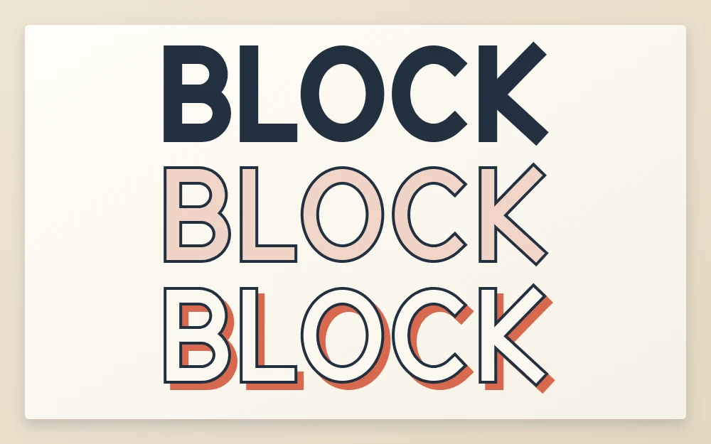
- Solid: fill with a marker, working just inside the outline first and then the middle.
- Outline only: leave the letters empty for a light, open look. Clean outlines matter most here.
- Stripes: evenly spaced diagonal lines, all at the same angle across the whole word.
Block capitals are also the easiest letters to give depth to. The guide to lettering shadows shows how to add a drop shadow or a 3D side.
To practice, repeat the process with a short word of straight letters, such as “LIFT” or “FILE”, before taking on S and W.
Frequently asked questions
How do I keep block letters the same thickness?
Use a gauge instead of judging by eye. Mark your chosen stroke thickness as two ticks on the edge of a paper strip, add a tick at the midpoint, and dot the outline positions along each skeleton stroke. Check horizontals against verticals afterward, because horizontal strokes are the ones most often drawn too thin.
Why do my block letters end up too close together?
The spacing was probably set for thin letters. Each skeleton stroke gains half the stroke thickness on both sides, so neighbors move toward each other as you build them up. Space the skeleton capitals much wider than looks right, and adjust the gaps in pencil before inking any outlines.
Can I draw block letters without a ruler?
You can, and slightly uneven freehand block letters have a friendly, casual look. For a first attempt, though, ruled guide lines and ruled straight edges make it much easier to see whether strokes are equal. Once the building method feels familiar, try the same word freehand over light guide lines.