Letter Anatomy for Hand Lettering: Baseline, X-Height and More
The five guide lines and eight letter parts a beginner actually uses, explained once in plain words, with a table of what each term means and a checklist for fixing a wobbly word.
Lettering instructions are full of small technical words: sit the letters on the baseline, keep the x-height even, shorten that ascender, open up the counter. Until you know what they point at, the advice is hard to use. Letter anatomy is simply the set of names for the lines letters sit on and the parts letters are made of.
You do not need the full vocabulary that type designers use. A beginner gets by comfortably with five guide lines and eight letter parts. Once you can name them, you can also say what is wrong with a word, and that makes it far easier to fix.
The five guide lines
Guide lines are the horizontal pencil lines that control the height of your letters. From top to bottom they are:
- Ascender line: the height reached by the tall lowercase letters b, d, f, h, k and l.
- Cap height: the height of the capital letters. It often sits a little below the ascender line, and many beginners simply use one line for both.
- X-height line, or waistline: the top of the small lowercase letters such as a, e, n, o and x. The distance from the baseline up to this line is the x-height.
- Baseline: the line every letter stands on.
- Descender line: the depth reached by the tails of g, j, p, q and y.
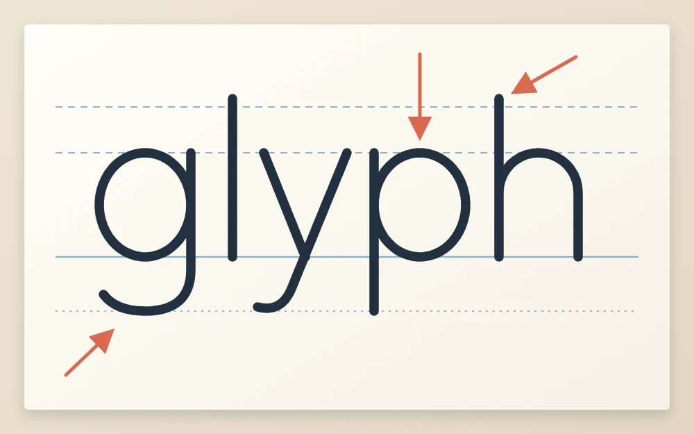
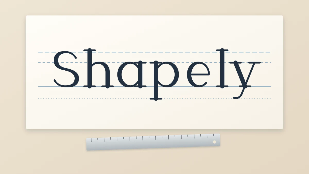
In the example, the solid line is the baseline. Look at how the round parts of g and p fill the space between the baseline and the x-height line, how l and h rise well above it, and how the tails of g, y and p drop below. Three zones, each with a fixed height, are what make a word look orderly.
The x-height matters most. It decides how large your lettering looks and how much room is left for the tall and hanging strokes. The article on ruling your own guide lines shows how to choose it and measure the other lines from it.
The main strokes: stem, bowl and crossbar
A stem is the main upright stroke of a letter: the vertical line in l, the left side of b, both uprights of H. Stems carry most of the visual weight, so if your stems lean at different angles, the whole word looks unsteady.
A bowl is a curved stroke that closes a round shape, as in b, d, p, o and the lower part of a. Bowls in one word should look related, like members of the same family. If the bowl of your d is a narrow oval and the bowl of your p is a fat circle, the word reads as inconsistent even when every letter is neat.
A crossbar is a horizontal stroke: the bar across t, f, A and H, and the bar that closes the eye of e. Crossbars are small, but their height is noticeable. Keep the bars of t and f at the same level, usually on or just under the x-height line.
The space inside: the counter
The counter is the enclosed or partly enclosed space inside a letter: the hole in o, the pocket inside n, the opening of c.
Counters are worth watching. When you thicken strokes, the extra weight eats into the counter. A counter that fills in makes the letter hard to read, especially in e and a.
The reaching parts: ascender and descender
An ascender is the part of a lowercase letter that rises above the x-height line. A descender is the part that drops below the baseline. Both words describe the stroke, while the ascender line and descender line describe where it should stop.
Beginners often let these parts vary: one l touches the top line, the next stops short. Checking that every ascender reaches the same line is one of the fastest ways to tidy a word. Many of these shapes come from a small set of repeated movements, which the guide to the eight basic strokes covers in detail.
The ends of strokes: serif and terminal
A serif is a small finishing stroke added to the end of a stem or arm, such as the little feet under a classic capital I. Letters without them are called sans serif. Serifs can be flat slabs, thin lines or small wedges, and drawing them well is a skill of its own, explained in the tutorial on adding serifs by hand.
A terminal is the end of any stroke that does not finish in a serif: the tip of the curve in c, the hook of f, the tail of y. Terminals may be cut straight, rounded or tapered. Whatever you choose, make the same choice through the whole word.
Letter parts at a glance
| Term | What it is | Why it matters when you draw |
|---|---|---|
| Baseline | The line letters stand on | Stops words drifting uphill or downhill |
| X-height | Height of a lowercase x | Sets the size of all the small letters |
| Cap height | Height of the capitals | Keeps capitals level with each other |
| Ascender | Stroke rising above the x-height | Should reach the same line every time |
| Descender | Stroke dropping below the baseline | Should hang to the same depth every time |
| Stem | Main upright stroke | Controls slant and weight |
| Bowl | Curved stroke closing a round shape | Round letters should share one shape |
| Counter | Space inside a letter | Must stay open to remain readable |
| Crossbar | Horizontal stroke | Needs a consistent height |
| Serif | Small finishing stroke on a stem | Lengths and shapes must match |
| Terminal | Stroke end without a serif | One style of ending per word |
Using the terms to fix a wobbly word
Here is the practical payoff. When a word looks wrong and you cannot say why, go through the parts in order and ask one question about each:
- Does every letter touch the baseline?
- Do all the small letters reach the x-height line, without stopping short or poking over?
- Do the ascenders and descenders end on their lines?
- Are the stems parallel?
- Do the bowls share one shape, and are the counters open?
- Are the crossbars level and the terminals finished the same way?
Usually only one or two answers are no. Fix those in pencil and leave the rest alone. Naming the fault turns a vague feeling that the word is off into a small, specific repair, and with practice you start to notice these things while you sketch.
Frequently asked questions
What is the difference between x-height and cap height?
The x-height is the height of the small lowercase letters such as x, a and n, measured from the baseline. Cap height is the height of the capital letters, which is noticeably taller. In most lettering the x-height is somewhere between half and two thirds of the cap height, though you can change that ratio to alter the style.
What is a counter in lettering?
A counter is the space inside a letter, either fully enclosed, as in o and b, or partly open, as in c and n. It matters because adding weight to strokes shrinks that space. When a counter fills in, the letter becomes harder to read, so thick styles need the counters kept deliberately open.
Do I need to memorize all the letter anatomy terms?
No. Start with baseline, x-height, ascender and descender, since those describe the guide lines you rule on every page. Add stem, bowl, counter and crossbar as you begin correcting your own letters. The terms stick naturally once you use them to describe a specific problem in a word you have drawn.