What Is Hand Lettering? Lettering, Calligraphy and Typography Explained
Hand lettering is the craft of drawing letters, not writing them. See how it differs from calligraphy and typography, which styles beginners meet first, and why slow, corrected pencil work is part of the method.
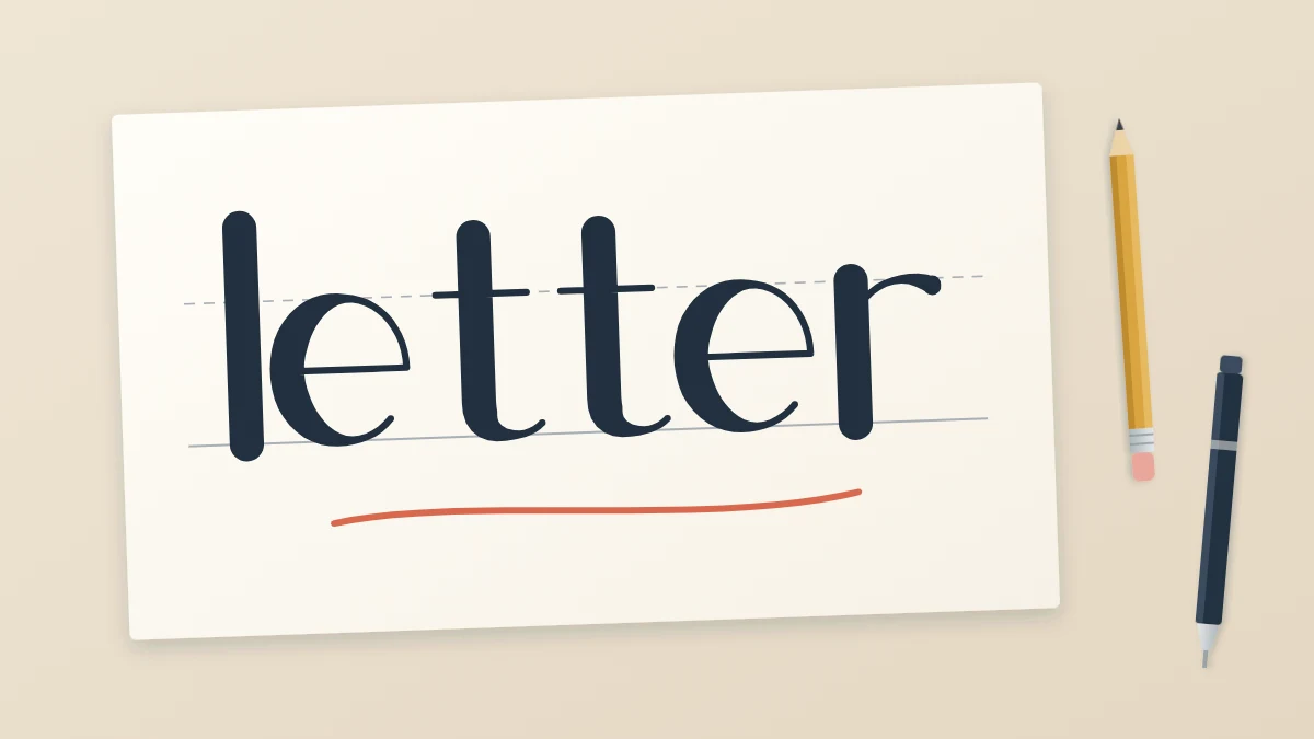
You have probably stopped at a chalkboard menu, a greeting card or a notebook cover and wondered how the words on it were made. If that left you asking what is hand lettering, the short answer is this: it is the craft of drawing letters. Each letter is treated as a small shape that you sketch, adjust and finish, much as you would draw a leaf or a cup.
That one idea, drawing instead of writing, is what separates lettering from calligraphy and from typography. The three words get mixed up all the time, and the mix-up leads beginners to believe they need skills or tools they do not need. Here is what each one means, and why the difference works in your favor.
Hand lettering is drawing letters
In lettering, a word is built up in stages. You start with a light pencil skeleton, which is the thin one-line version of each letter. Then you add weight to some strokes, adjust the spacing, clean up the edges and only then go over the result in ink.
Nothing has to be right the first time. You can erase a letter, redraw it wider, move it a little to the left or change its style halfway through. The finished word may look as if it flowed out in one confident motion, but it was usually assembled slowly, with plenty of corrections that nobody will ever see.
A lettered word is also made for one specific place. The letters in a word on a card are drawn to fit that card and to fit each other, so two copies of the same letter in one word can be slightly different on purpose.
Calligraphy is writing letters
Calligraphy is writing, done beautifully. Each part of a letter is made in a single practiced stroke, and the tool creates the contrast. With a brush pen or another flexible tip, pressing on the way down gives a thick downstroke and lightening on the way up gives a thin upstroke.
Because every stroke is made once, there is little room to repair it. Calligraphy depends on rhythm and on muscle memory built through many repetitions of the same strokes. It is a rewarding skill, but it asks for more patience before the results look controlled.
Typography is arranging ready-made letters
Typography does not involve making letters at all. It is the work of choosing and arranging letters that already exist as type, such as the text on this page. Somebody designed that set of letters once, and every time an “e” appears it is the identical shape.
Typography is about size, line length, spacing and hierarchy. Those ideas are useful in lettering too, especially when you arrange a phrase, but in typography nobody draws anything by hand.
The three side by side
| Practice | How the letters are made | Can you correct them? | Typical tools |
|---|---|---|---|
| Hand lettering | Drawn and built up in stages | Yes, at every stage before ink | Pencil, eraser, ruler, any pen |
| Calligraphy | Written in single strokes | Rarely; you write the word again | Brush pen, dip pen, broad-edge pen |
| Typography | Chosen from existing type | Yes, by changing settings | Type and a layout |
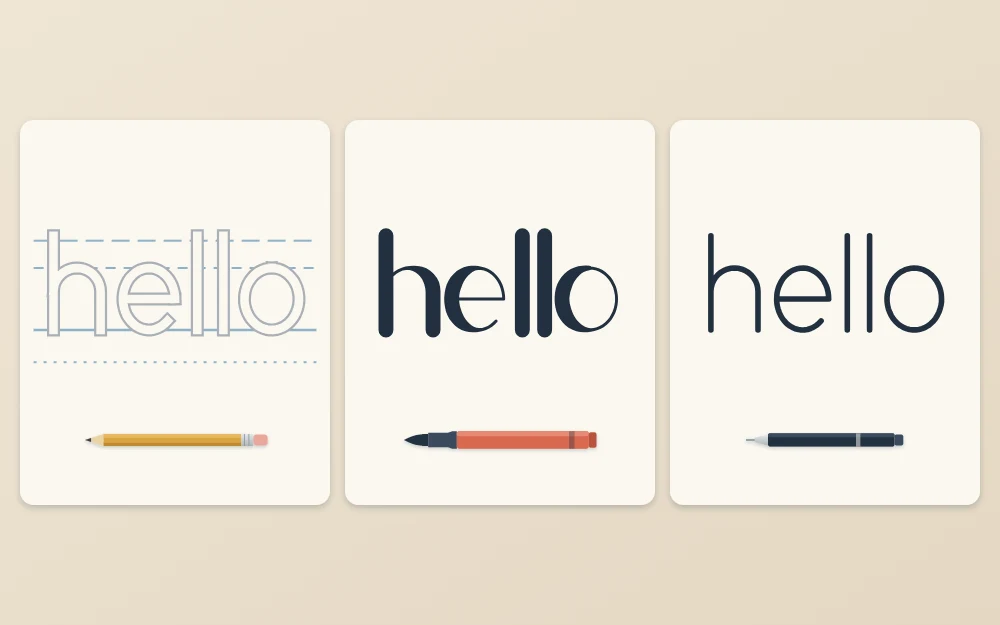
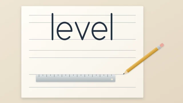
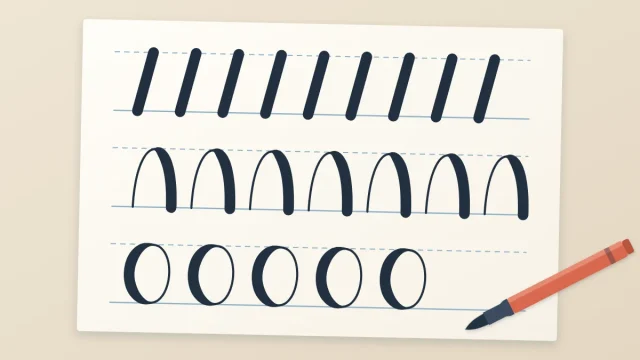
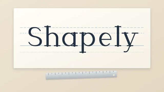
Notice the first version in the row. The guide lines and the outline are still visible, which is exactly how a lettered word looks while it is in progress. The second version gets its contrast from a flexible tip. The third keeps one line weight throughout.
Why the difference matters when you are starting
If lettering were handwriting, you would need neat handwriting to be good at it. It is not. Plenty of people with untidy everyday writing letter well, because they are using a different skill: looking at a shape, comparing it with the shapes next to it and correcting it.
Lettering forgives slow work. You may spend several minutes on one word, turn the paper, rest your hand and come back to it. A pencil and an eraser are part of the method, not a sign that you are doing it wrong. That makes it a comfortable place to begin, even if you later want to learn calligraphy as well.
Tip
When a word looks wrong, do not start over. Find the one letter that bothers you most, fix only that, and look again.
The styles a beginner meets first
Lettering styles are families of shapes, not fixed alphabets. You will run into these early on:
- Monoline: every stroke has the same line weight, drawn with a fineliner, gel pen or pencil.
- Faux calligraphy: an even-line word with a second line drawn beside each downstroke, so it gains thick and thin contrast. The faux calligraphy method works with any pen.
- Block letters: bold capitals built as outlines around a skeleton, then filled or left open.
- Serif and sans serif styles: upright letters with small finishing strokes at the ends of the stems, or without them.
- Brush lettering: script made with a brush pen. It sits on the border with calligraphy, because the strokes are written, yet many people still sketch the layout in pencil first.
You do not have to choose one. Most beginners try two or three, then stay with whichever feels most natural for a while.
What you need to begin
Very little. An HB or 2B pencil, a soft eraser, a ruler, one fineliner and some smooth printer paper are enough for monoline, faux calligraphy, block, serif and sans serif styles. A brush pen can wait until you want to try brush lettering.
A small vocabulary helps more than extra tools. Words such as baseline, x-height, stem and bowl let you describe what is wrong with a letter, which is the first step toward fixing it. The guide to the parts of a letter explains each term once.
Where to go next
Lettering is learned in a sensible order: basic strokes, guide lines, one simple alphabet of your own, a first word, then spacing and styles. Progress is gradual, and early pages usually look uneven. That is normal and it does improve with regular, short practice.
For a clear sequence of first steps, including what to gather and how long to practice, continue with the starting guide for complete beginners.
Frequently asked questions
Is hand lettering the same as calligraphy?
No. Calligraphy is writing: each stroke is made once with a tool that creates thick and thin lines. Hand lettering is drawing: letters are sketched, corrected and built up in stages before ink. The two can look similar when finished, and many people enjoy both, but they train different skills.
Do I need good handwriting to learn hand lettering?
No. Handwriting is fast and automatic, while lettering is slow and deliberate. You draw each shape, compare it with its neighbors and adjust it with a pencil and eraser. People with untidy everyday writing often letter well, because the skill being used is observation and correction, not speed.
Is hand lettering a font?
No. A font is a ready-made set of letters in which every copy of a letter is identical. Hand lettering is drawn for one specific word and place, so the letters are shaped to fit each other. Arranging existing type is called typography, which is a separate discipline.