Serif Lettering by Hand: How to Add Serifs to Your Letters
What a serif is, four serif shapes a beginner can draw, and a layered method for serif-inspired capitals: skeleton letters, thickened downstrokes, then serifs of equal length at the stem ends.
Lesson at a glance
What you need
- HB pencil
- Soft eraser
- Ruler
- Fineliner pen
- Graph paper
Serif lettering has a classic, bookish look: letters with thick and thin strokes and small finishing marks at the ends of their stems. Drawn by hand, the style is more approachable than it appears, because you build it in layers and correct each layer in pencil.
This tutorial explains what a serif is, describes four serif shapes a beginner can draw, and then walks through a method for serif-inspired capitals of your own: skeleton first, weight second, serifs last.
What a serif is
A serif is a small stroke attached to the end of a larger stroke of a letter. On a capital I, the serifs are the short marks across the top and bottom of the stem. Letters without them are called sans serif.
Serifs do two jobs in hand lettering. They give stroke ends a clean, deliberate finish, and they create a horizontal rhythm along the baseline and cap height line that ties a word together. If terms such as stem, bowl and crossbar are unfamiliar, the guide to letter anatomy defines them.
Four serif shapes you can draw
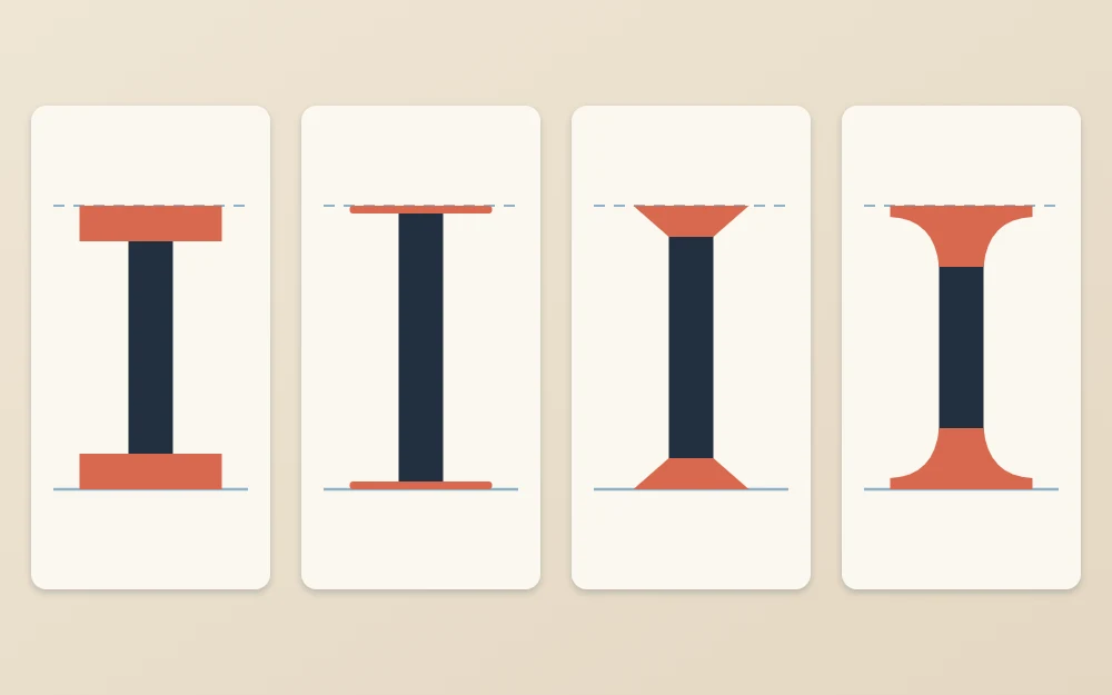
These are general families, not specific designs to reproduce. Pick one shape for a piece and use it on every letter.
| Shape | How to draw it | Look |
|---|---|---|
| Slab | A rectangle across the stem end, about as thick as the thin strokes or heavier | Sturdy, bold |
| Hairline | A single thin line across the stem end | Elegant, crisp |
| Wedge | A small triangle that widens from the stem out to a point on each side | Sharp, lively |
| Bracketed | A thin serif joined to the stem by a small curve on each side | Traditional, soft |
What you need
- A sharp HB pencil and a soft eraser
- A ruler
- A fineliner for outlines and fills
- Smooth printer paper or graph paper
Rule a baseline and a cap height line about 1 in (2.5 cm) apart. Serifs are small details, so letters drawn at this size give you room to keep them tidy.
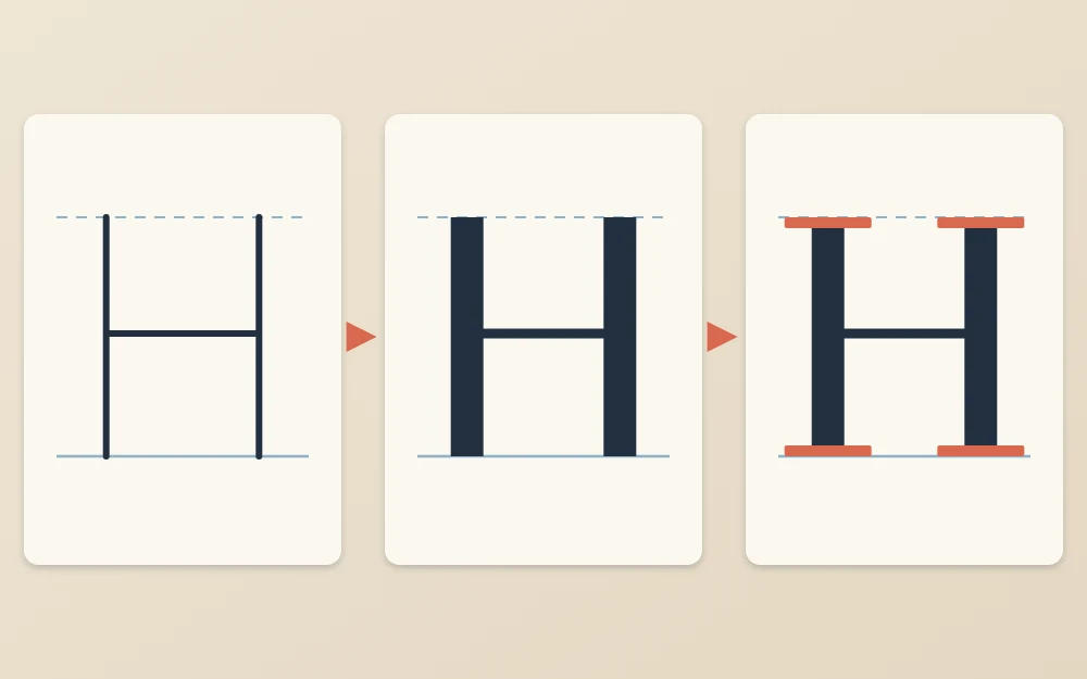
The method: skeleton, weight, serifs
- Draw skeleton capitals. Sketch the word in thin, plain capitals between the lines. Leave extra space between letters, because serifs stick out sideways and need room. Check that verticals are upright and letter widths look related.
- Thicken the downstrokes. Add a second line beside each thick stroke to make a band. A stem about one fifth as wide as the letter is tall gives a medium weight. Leave the thin strokes as single lines, or double them into a narrow band for a sturdier look. Check that every thick stem is the same width.
- Add serifs to the stem ends. Wherever a stem ends on the baseline or cap height line, draw a serif across it, centered on the stem. Check that the serifs lie exactly on the guide lines, not above or below them.
- Refine and ink. Clean up joins in pencil, outline with a fineliner, fill the thick strokes, let the ink dry fully and erase.
If you are left-handed, fill the letters from right to left across the word, or rest your hand on a scrap sheet, so you do not smudge wet fills.
Which strokes are thick and which are thin
The contrast in serif-inspired letters follows a pattern, and it is drawn, not pressed. A fineliner or pencil makes one line weight, so you outline each thick stroke and fill it in.
- Vertical stems are thick: the stems of B, D, E, F, H, I, K, L, P, R and T.
- Horizontals are thin: crossbars and the arms of E, F, L and T.
- Diagonals running from upper left to lower right are thick: the right leg of A, the left stroke of V and the diagonal of N.
- Diagonals running the other way are thin: the left leg of A and the right stroke of V.
- Round letters are thick at the sides: an O is heaviest at its left and right and thinnest at top and bottom.
Two capitals break the pattern. In N, the two vertical stems are thin and only the diagonal is thick. In M, the outer left stem is thin and the outer right stem is thick.
Common mistake
Making every stroke thick. That produces a block letter with serifs attached. If you want heavy, even strokes, the guide to block lettering is the better starting point, and slab serifs suit it well.
Keep serif lengths equal
Uneven serifs are the most common weakness in hand-drawn serif letters. Three rules keep them under control.
- One length: let each serif extend past the stem by the same amount on both sides, roughly half a stem width. Mark that distance on a scrap of paper and use it as a gauge.
- One thickness: every serif in the word is as thick as every other.
- Shorten where letters would collide: on the inner sides of letters such as M and N, or between two close stems, trim the serifs so they do not touch. Keep the outer ones full length.
Strokes that end in a point, like the top of A or the bottom of V, usually take no serif. The ends of thin arms on E, F, L and T get a small vertical serif that points along the stroke end.
Check the overall color
In lettering, color means how evenly dark a word looks as a whole. Prop the sheet up, step back and squint until the letters blur into a gray band.
- A dark patch means stems are too close or serifs are crowding one another. Open the gap.
- A pale patch means a gap is too wide or a thick stroke is too thin.
- One letter that stands out as heavier usually has a stem wider than the rest.
Make these corrections in pencil before inking. Serifs change how spacing looks, so always judge it after they have been added.
Practice and variations
Begin with words made mostly of straight capitals, such as “HILL”, “LIFE” or “THE”, then add round letters. Once the method feels familiar, change one thing at a time: a heavier slab, more contrast between thick and thin, or narrower letters. Clean serifs develop gradually, so expect the first sheets to look uneven.
It also helps to draw the same word without serifs and compare the two side by side. The guide to sans serif hand lettering covers that plainer skeleton.
Frequently asked questions
What is the easiest serif to draw by hand?
Slab and hairline serifs are the simplest, because each is a straight line or small rectangle across the end of a stem and can be drawn with a ruler. Bracketed serifs, which join the stem with a small curve on each side, take more practice to keep matching from letter to letter.
Do all strokes get serifs?
No. Serifs go on the ends of stems and on the ends of thin arms, such as those on E, F, L and T. Strokes that meet in a point, like the top of A or the bottom of V, are usually left plain. Curved letters such as O have no stroke ends and take none.
Can I draw serif letters with a regular pen?
Yes. The thick strokes are outlined and filled in, not made with a special tip, so a pencil for sketching and a fineliner for inking are enough. Work at a fairly large size at first, around an inch tall, so the serifs are big enough to draw neatly.