Sans Serif Hand Lettering: Clean, Simple Letters for Beginners
Draw clean sans serif capitals from three simple shape families, keep their widths related, and vary the result as light, bold, condensed or wide-spaced letters.
Lesson at a glance
What you need
- HB pencil
- Soft eraser
- Ruler
- Fineliner or gel pen
- Graph paper or dot grid pad
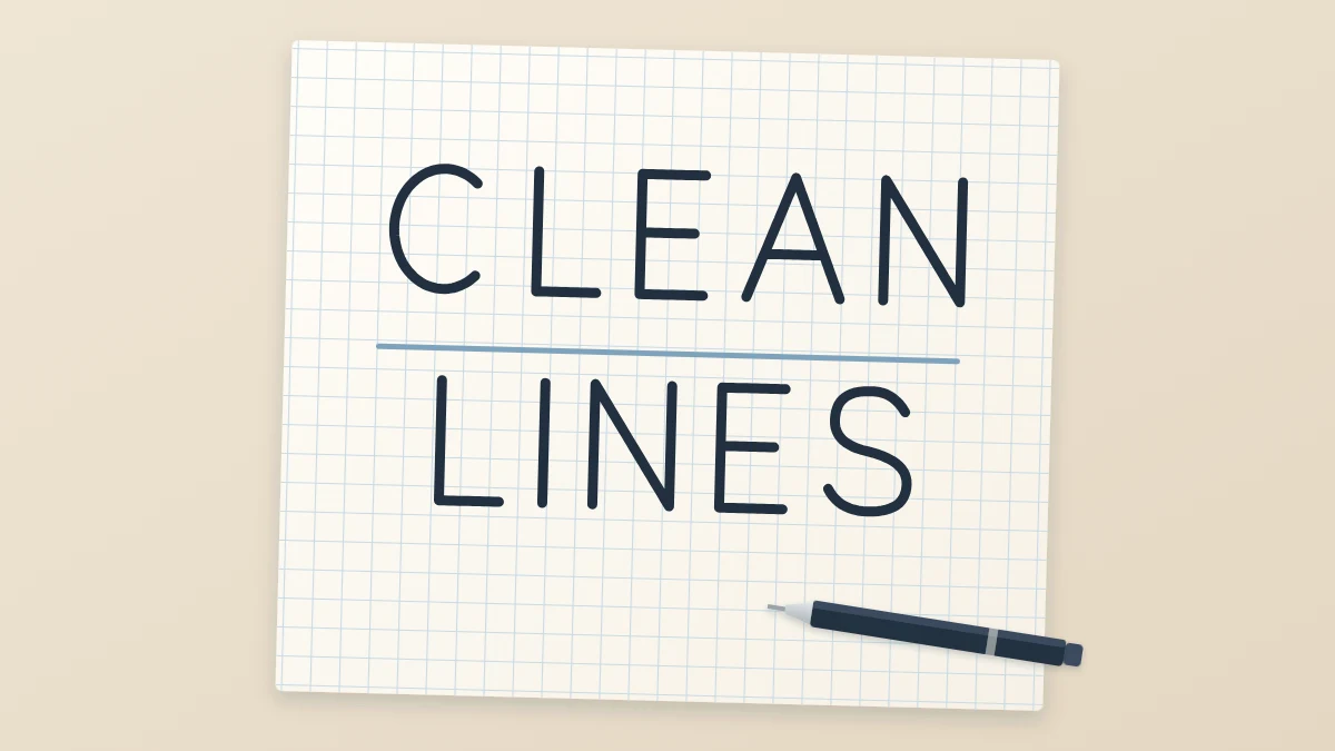
Sans serif letters are the plain, upright ones you see on signs, labels and headings: no small feet at the ends of the strokes and no decoration, only clean lines. “Sans” simply means “without”, so a sans serif letter is a letter without serifs.
That plainness makes sans serif hand lettering a good early style. There is little to learn besides proportion, and every capital comes from one of three simple shapes: a circle, a square or a triangle. Plain letters hide nothing, though, so even widths and heights matter.
What you need
- An HB pencil and a soft eraser
- A ruler
- A fineliner or gel pen
- Graph paper, a dot grid pad or smooth printer paper
Capitals need only two guide lines. Rule a baseline and a cap height line 3/4 in (2 cm) apart, lightly, so they erase later.
Draw the capitals in three families
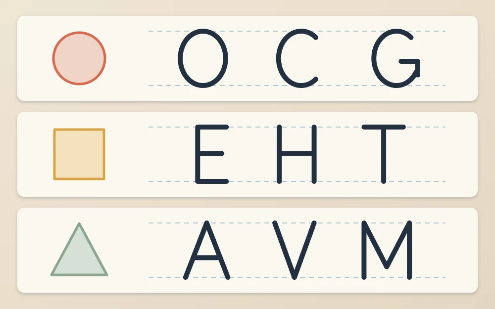
The letters in each family share one underlying shape. Sketch every letter as a thin pencil skeleton first.
Round letters: O, C, G, Q
Begin with O, drawn as close to a circle as you can manage. Use two strokes that both start at the top: the left half curving down to the baseline, then the right half curving down to meet it. C is the same circle with an opening on the right, about a quarter of the ring left out. G is a C with a short horizontal bar running inward from its lower end at about mid-height. Q is an O with a short diagonal tail crossing the lower right of the ring.
Square letters: E, F, H, L, T
These are stems and bars. Draw every stem from the cap line down to the baseline, and every bar from left to right. E is a stem with three arms; make the top and bottom arms equal and the middle arm a little shorter. F is an E without the bottom arm, L keeps only the bottom arm, and T is a crossbar along the cap line with a stem dropped from its center. H is two stems joined by a crossbar.
Diagonal letters: A, V, W, M, N
A is two diagonals that start together at the cap line and spread to the baseline, joined by a crossbar about a third of the way up. V is that shape upside down with no crossbar. W is two narrow V shapes side by side that share the middle peak. N is two stems with a diagonal running from the top of the left stem to the foot of the right one. M is two stems with a V between them whose point drops to the baseline.
Keep the widths related
Width is what makes a row of plain capitals look designed instead of accidental. Decide the widths once, as fractions of the cap height, and hold to them.
| Letters | Width compared with cap height |
|---|---|
| O, C, G, Q | About equal: a near circle |
| E, F, L | About half |
| H, T, N, A, V | About three quarters |
| M, W | A little wider than the O |
These are starting points, not laws.
Straight ends and two optical corrections
End every stroke cleanly. Stems stop exactly on the guide lines, and bars end with a straight cut instead of a flick.
Two small corrections are worth learning early, because the eye does not measure the way a ruler does:
- Overshoot. A round letter that only just touches the guide lines looks smaller than a flat-topped letter beside it. Let O, C, G and Q pass the cap line and the baseline by about the thickness of your pen line.
- Raised middles. A crossbar at the exact center of H or E looks as if it is sagging. Move it up by a hair.
Letter a first word
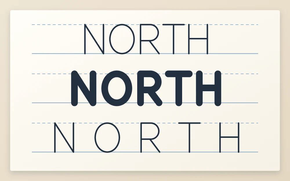
- Rule your two guide lines and choose a short word such as NORTH.
- Sketch the skeleton letters in pencil. R is new: a stem, a half-round bowl in its upper half, and a diagonal leg from under the bowl to the baseline. Check that every stem is upright and reaches both lines.
- Compare the widths with the table and redraw any letter that drifted.
- Look at the gaps. An open letter such as T leaves extra white space at its sides, so its neighbors sit closer; the guide to spacing letters by eye explains how to judge this.
- Ink the skeleton with slow, even strokes, pulling each line toward you and turning the paper when that helps. Let the ink dry fully, then erase the pencil.
If you are left-handed, ink the word from right to left or rest your hand on a scrap sheet, so it never crosses wet lines.
A skeleton inked with one pen is a monoline letter. The guide to monoline lettering goes further into keeping those single lines steady.
Four easy variations
Once the plain version is reliable, change one rule at a time.
- Light. A fine pen and full letter widths. Good for labels.
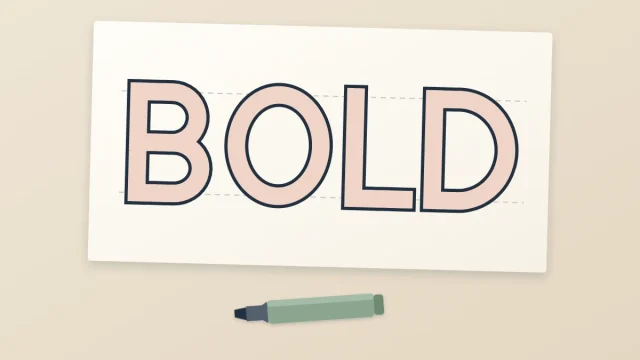
- Bold. A fineliner makes one line weight however you hold it, so weight has to be drawn. Add an outline around each skeleton stroke to make an even band, then fill it. That method is taught in block lettering step by step.
- Condensed. Keep the cap height and cut every width roughly in half. The O becomes an upright oval.
- Wide-spaced. Thin capitals with gaps nearly as wide as the letters. It looks calm, but it shows uneven gaps more than any other version.
Pairing plain capitals with a script-like word
Plain capitals make a good supporting voice. In a short phrase, letter the one important word large in a flowing, script-like style and set the other words small in wide-spaced capitals. The contrast does the work: one style curves and connects, the other stands still.
Keep the capitals around a third of the script word’s height, and use one pen for both.
What to check, and how to repeat it
Hold the finished word at arm’s length and ask three questions. Do the round letters look the same height as the flat ones? Do matching letters have matching widths? Are all the stems upright?
Then repeat with a new word that leans on a different family: COG for round letters, THE for square ones, WAVE for diagonals. Expect the first few rows to look uneven. Widths settle gradually, over many short sessions.
Frequently asked questions
What does sans serif mean in lettering?
It means without serifs. A serif is the small foot or bar at the end of a stroke. Sans serif letters leave those out, so each stroke simply stops with a clean, straight end. The result looks plain and modern, and it suits headings, labels and short words on cards.
Why do my round letters look smaller than the others?
A curve touches a guide line at only one point, while a flat-topped letter touches it along its whole width. The eye reads the curve as shorter. Let round letters pass the top and bottom lines very slightly, by about one pen-line thickness, and the row will look even again.
Should I learn capitals or lowercase first in this style?
Capitals are the easier start. They need only two guide lines, they share one height, and most are built from straight lines and one circle. Once widths and spacing feel steadier, lowercase adds an x-height line plus ascenders and descenders to manage, which is more to keep track of at once.