Pencil Sketching for Lettering: From Rough Sketch to Final Ink
A dependable sketch-to-ink routine: four pencil passes that fix layout, shape, weight and spacing, followed by a calm inking order that keeps the page clean.
Lesson at a glance
What you need
- HB pencil
- 2B pencil
- Soft eraser
- Ruler
- Tracing paper
- Fineliner pen
- Bullet-tip marker
Most lettering that looks effortless was drawn several times before any ink touched the page. A lettering sketch is where you make your mistakes cheaply: a crooked stem costs one pass of the eraser instead of a whole new sheet.
If you tend to reach for the pen after a few faint lines and then regret it, the fix is not more talent. It is a fixed order of work. The process below has four pencil passes and one ink pass, and each pass has only one job.
What you need
- An HB pencil for light construction lines and a 2B pencil for darker, softer build-up
- A soft eraser that lifts graphite without roughing up the paper
- A ruler
- Smooth printer paper, plus a sheet of tracing paper if you want a clean redraw
- A fineliner for outlines and a bullet-tip marker for filling
An HB pencil makes a pale line that erases easily. A 2B is softer and darker, which helps when you want to see shapes clearly, but it also smudges more. Start with HB and switch to 2B only once the letters are in the right place.
Pass 1: the thumbnail
Before drawing at full size, draw three or four tiny versions of the piece, each about 2 in (5 cm) wide. Use scribbled shapes rather than neat letters. You are only deciding how the words stack, which word is biggest and where the whole block sits on the sheet.
Pick the thumbnail that reads most clearly at a glance. If you want more help with arranging words, the article on lettering composition covers hierarchy and balance in detail.
Pass 2: the skeleton on guide lines
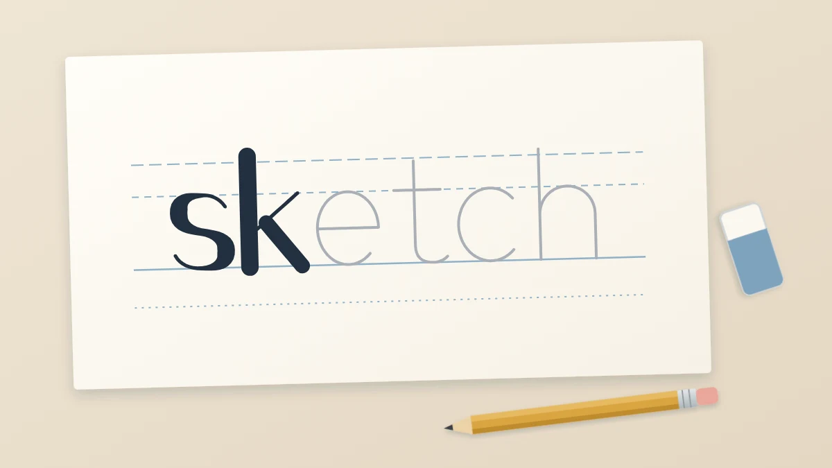
Rule your baseline, x-height line and cap height lightly with the HB pencil; the steps are in the guide to lettering guidelines. Then draw each letter as a skeleton: a single thin line with no thickness and no decoration.
- Mark the left and right edges of the word with two small ticks so you know how much room you have.
- Draw the skeleton of the first and last letters, then fill in the letters between them.
- Check that every letter touches the baseline and that lowercase letters reach the x-height line.
- Check the slant: all stems should lean the same way, or all stand upright.
Hold the pencil a little farther back than you would for writing. A loose grip keeps the line faint, and a faint line is the whole point of this pass.
Pass 3: the build-up
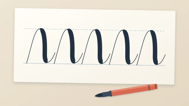
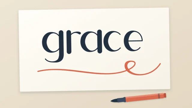
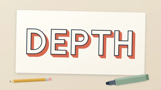
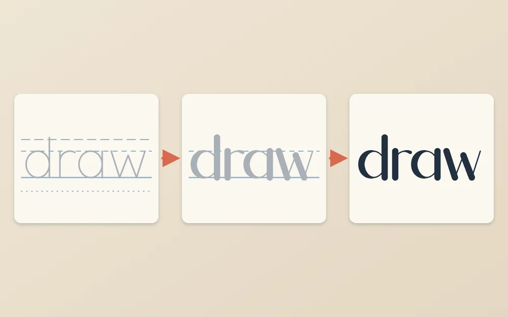
Now give the skeleton its weight and style. For a script or faux calligraphy style, add a second line beside each downstroke so the downstrokes become thick and the upstrokes stay thin. For block letters, draw an even outline around every skeleton line. For serif-inspired letters, add the small feet at the ends of the stems.
This is also the pass for spacing. Squint at the word, or turn the sheet upside down, and look at the gaps between letters instead of the letters themselves. The white spaces should look roughly equal in area. Where two letters crowd each other or drift apart, erase one and move it. Shifting a letter now takes a few seconds; after inking it is impossible.
Pass 4: refining
By now the sketch probably has several ghost lines around each stroke. Refining means choosing one edge and committing to it. You have two ways to do this.
Clean up on the same sheet
Dab the sketch with the eraser until the lines are pale, then redraw the final edges with a sharp 2B. Straight stems get one confident line each. Curves are easier if you turn the paper so your hand pulls the curve toward you.
Redraw on tracing paper
Lay a sheet of tracing paper over your own sketch and draw only the lines you want to keep. This leaves the mess behind and gives you a clean draft. You can slide the tracing paper slightly between letters to correct spacing as you go, which is harder to do on the original.
Tip
Rest your drawing hand on a scrap sheet of paper. It stops the side of your hand from dragging graphite across the page and keeps skin oils off the surface, which helps ink go down evenly later.
Inking: outline first, fill second
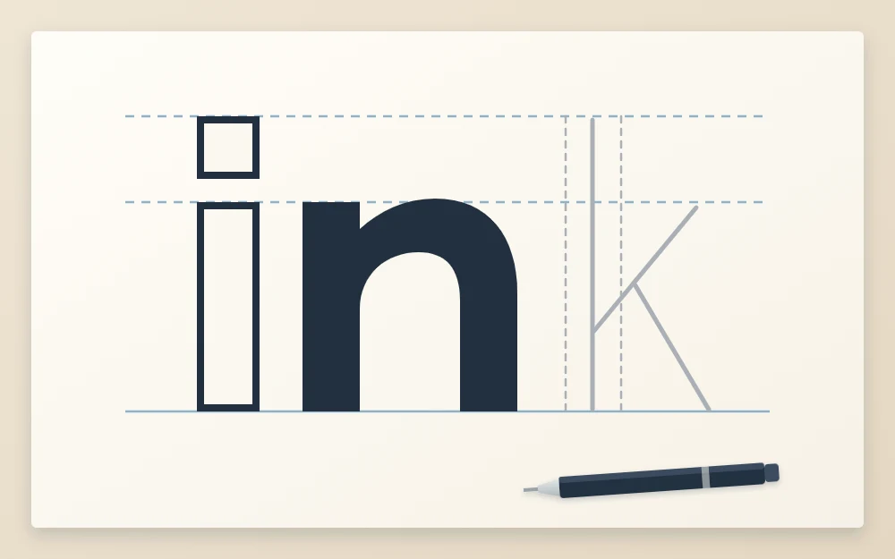
Choose pens that suit the paper and the size of the letters; the overview of hand lettering pens explains which tip does what. A fineliner and a bullet-tip marker make one line weight however hard you press, so the thick strokes you see in the final piece are drawn and filled, not pressed. Only a flexible tip such as a brush pen changes width with pressure.
- Trace the outer edge of each letter with the fineliner, moving slowly and lifting the pen at corners.
- Step back and check the outlines before filling anything. A wobbly edge can still be widened slightly at this point.
- Fill the thick strokes with the marker, working from the outline inward so the marker never crosses the edge.
- Leave the sheet alone until the ink is fully dry. Filled areas take longer than thin lines; a few minutes is usually enough, but test a corner with a fingertip first.
- Erase the pencil gently, in one direction, holding the paper flat with your other hand.
If you are left-handed, ink from right to left or turn the paper so your hand stays clear of wet lines, and keep that scrap sheet under your hand.
Common mistake
Erasing too soon. Ink that looks dry can still smear under an eraser and leave a gray streak across the letter. When in doubt, wait longer.
Keeping the process going
Run the full sequence on one short word a few times before trying a phrase. Good practice words are four to six letters long with a mix of straight and round shapes, such as “draw” or “sketch”.
To vary the exercise, keep the same skeleton and change only the build-up: once as block letters, once with serifs, once as faux calligraphy. You will see how much of the final look is decided in pass three, and how much depends on a patient pass two. Speed comes gradually; at first, expect the pencil stages to take far longer than the inking.
Frequently asked questions
Which pencil is best for sketching lettering?
An HB pencil is a sensible default because its line is pale and erases cleanly. A softer 2B is useful later, when the letters are in position and you want darker, clearer edges. Very soft grades smudge easily, and very hard ones can dent the paper, so most beginners do well with just these two.
How long should ink dry before erasing pencil lines?
It depends on the pen and the paper. Thin fineliner lines on plain paper often dry within a minute or so, while solid filled areas and coated papers can need several minutes. Touch a filled corner lightly with a fingertip first, and if anything transfers, give it more time.
Do I have to use tracing paper to refine a sketch?
No. You can lighten the sketch with a soft eraser and redraw the final edges on the same sheet. Tracing paper laid over your own draft simply gives you a cleaner copy and lets you nudge letters sideways to correct spacing, which some people find easier.