Lettering Shadows: How to Add Drop Shadows and 3D Depth
Four shadow effects in rising difficulty, from a thin drop line to a solid 3D block, with one rule that keeps them all convincing: a single light direction.
Lesson at a glance
What you need
- HB pencil
- Soft eraser
- Ruler
- Fineliner pen
- Gray bullet-tip marker
- White gel pen (optional)
A shadow is one of the quickest ways to make flat letters look as if they sit above the page. Lettering shadows need no special pen and no drawing talent, only a ruler-straight habit: every shadow in the piece must fall in the same direction.
The four effects below go from a single thin line to a solid 3D block. Work through them in order on one word, because each one builds on the step before it.
What you need
- HB pencil and a soft eraser
- Ruler
- Fineliner for outlines
- A gray or light-colored bullet-tip marker for the shadow
- Smooth printer paper or marker paper
Start with simple, sturdy capitals. If you have not drawn them yet, the tutorial on block lettering shows how to build even, thick capitals from a skeleton. A short word such as “SHADE” is ideal: it has straight letters, a diagonal and round letters.
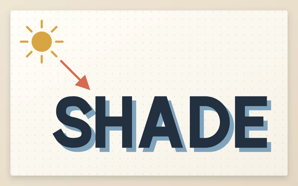
Choose one light direction and keep it
Imagine a lamp at the top left of your sheet. Light travels from there toward the lower right, so every shadow falls on the right side and the bottom of each stroke. This is the usual choice because it suits the direction most people read and draw in, but any direction works as long as it never changes within a piece.
Before you start, draw a small arrow in pencil in the corner of the sheet pointing the way the shadow falls. Glance at it whenever you are unsure which side of a stroke to shade.
Common mistake
Shading the right side of some letters and the left side of others. Mixed directions cancel the effect, and the word looks smudged instead of raised.
Effect 1: the drop line
The drop line is a thin line drawn just outside the right edge and the bottom edge of every stroke. It works on any style, including thin monoline letters, and it is hard to get badly wrong.
- Ink your word and let it dry.
- With a fineliner or gray marker, draw a line along the right side of each vertical stroke, leaving a hairline gap of white between the letter and the line.
- Add the same line under each horizontal stroke and along the lower right of each curve.
- Check: no line should appear on a left edge or a top edge.
Remember the inside edges too. The counter of an “A” or a “D” has a left wall that faces right, and it gets a line as well.
Effect 2: the offset drop shadow
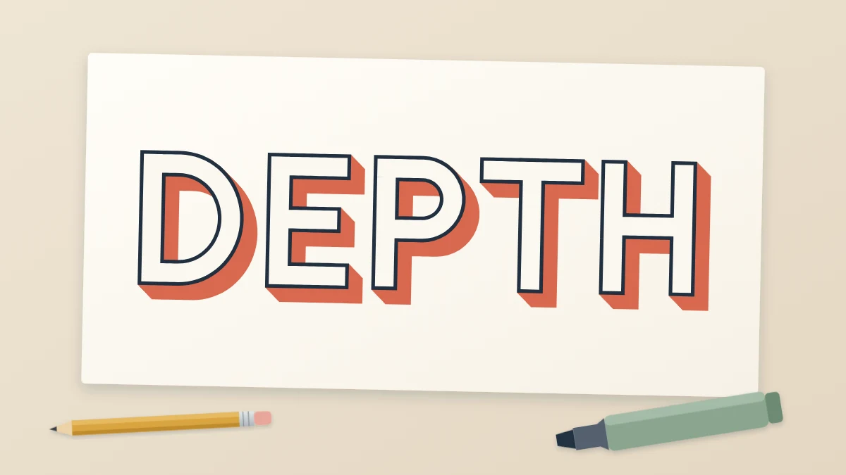
Here the whole letter is repeated, shifted down and to the right, and only the part that peeks out from behind the original is filled in.
- Pencil your letter as an outline.
- Decide the offset. About 1/8 in (3 mm) to the right and the same distance down suits letters around 1 in (2.5 cm) tall.
- From each corner of the letter, mark a dot at that offset. Join the dots with lines parallel to the original edges.
- Erase any part of the copy that falls inside the original letter.
- Ink the letter, then fill the visible strip of the copy with gray or a lighter color.
Check that the strip is the same width beside every vertical stroke. Uneven widths are the first sign that the offset drifted.
Effect 3: the 3D block
A 3D block is the offset shadow with one extra step: the corners of the letter are joined to the matching corners of the copy with short diagonal lines, so the letter appears to have solid sides.
- Draw the letter and its offset copy in pencil, as in effect 2.
- From every outer corner on the right and bottom of the letter, draw a short diagonal to the same corner on the copy. All diagonals are parallel and equal in length.
- Erase the hidden lines inside the letter.
- Ink the letter outline, the diagonals and the outer edge of the copy.
- Fill the side faces with a solid color, or shade them with close parallel lines.
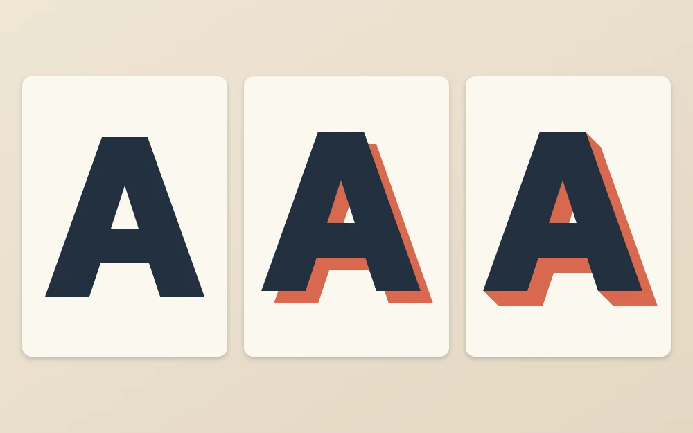
The crisp corners of slab-style capitals make this effect especially clear, so it is worth trying on the shapes from the serif lettering tutorial once plain blocks feel comfortable. Each serif simply gets its own short diagonals.
Effect 4: the highlight line
A highlight is the opposite of a shadow: a thin strip of bare paper left inside the stroke on the side facing the light. With light from the top left, it runs just inside the left edge and the top edge.
Pencil the highlight as a narrow line before you fill the letter, then fill around it. Keep it short of the stroke ends so it floats inside the shape. On dark fills, a white gel pen drawn over dry ink does the same job.
Shadows on round letters
Curves cause the most doubt. On an “O”, the shadow is thickest at the lower right of the outer edge and tapers to nothing at the upper right and lower left, where the curve turns away from the shadow direction. Inside the counter, the shaded part sits at the upper left wall, because that wall faces the lower right.
An easy check for the offset method: pencil the entire letter a second time at the offset, curves included, then erase what the original covers. Whatever remains is the shadow, and it will taper correctly without any guessing.
Color and restraint
A shadow should be quieter than the letter. Mid gray is the safe choice; a lighter tint of the letter color also works. Black shadows on black letters merge into one heavy shape unless you leave a clear white gap between them.
Tip
Use one effect per piece. A drop line plus a 3D block plus a highlight on the same word competes for attention and makes the letters harder to read.
If you are left-handed, your hand travels over fresh ink when shading toward the right. Let each letter dry before moving on, or turn the sheet and work from the last letter back to the first.
To practice, letter the same word four times down a page and add one effect to each line. Then repeat with the light coming from the top right, which moves every shadow to the left and bottom.
Frequently asked questions
Which side should a lettering shadow go on?
Any side works, provided it is the same for every letter. Most people place the light at the top left, which puts the shadow on the right and bottom of each stroke. Decide before you begin and mark a small pencil arrow on the sheet as a reminder.
What color should I use for a shadow?
A mid gray suits almost every letter color and is the easiest starting point. A paler tint of the letter color gives a softer look. Avoid a shadow that is as dark as the letter itself unless you leave a visible white gap between the two shapes.
How far should the shadow be offset from the letter?
A useful starting point is roughly one eighth of the letter height, shifted equally sideways and downward. Smaller offsets look subtle and tidy, while larger ones look bold but need more accurate drawing. Whatever distance you choose, keep it identical for every letter in the word.