Hand Lettering for Beginners: How to Start From Zero
A clear order of first steps for complete beginners: the five things to gather, what to learn first, how long to practice, what progress realistically looks like and a plan for your first session.
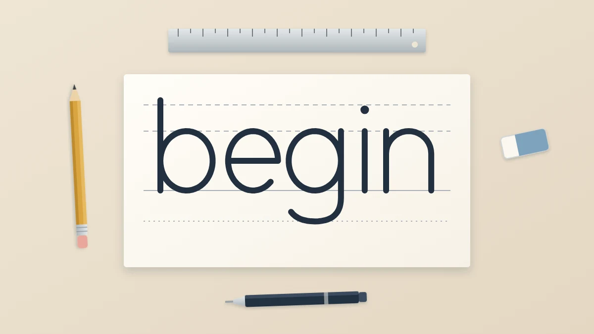
Starting anything from zero is easier when someone tells you what to do first, what to do second and what to ignore for now. Hand lettering for beginners can look more complicated than it is, mostly because finished pieces hide the plain steps underneath them: a few pencil lines, a thin sketch and a lot of small corrections.
This page is an orientation. It gives you a short list of things to gather, an order to learn in, a realistic idea of how much to practice and honest answers to the worries most people have at the start. Each step points to a detailed guide when you are ready for it.
First, a reassurance about handwriting
Untidy handwriting is not a disadvantage. Handwriting is quick and automatic; lettering is slow and deliberate. You are drawing shapes, checking them against guide lines and adjusting them with an eraser, and none of that depends on how you sign your name.
If you are unsure how lettering differs from calligraphy or from type on a screen, the explanation of what hand lettering actually is clears that up in a few minutes. The short version: you are allowed to take your time and fix things.
What to gather
You need five things, and you may own most of them already:
- A pencil, HB or 2B, for sketching and for guide lines
- A soft eraser that lifts pencil without roughening the paper
- A ruler for straight, parallel guide lines
- One pen, ideally a fineliner with a medium tip
- Smooth paper, such as ordinary printer paper or a dot grid pad
That is enough for the first several weeks. Brush pens, markers and special papers are pleasant extras, not requirements, and buying them early tends to add confusion. The guide to a simple starter kit explains what each item does and what can wait.
The order to learn in
Lettering skills stack. Each step below makes the next one easier, so resist the pull to jump straight to a long quote.
- Basic strokes. Letters are built from a small set of repeated movements: lines, arches, cups, ovals and loops. Practicing the eight basic strokes in rows trains your hand faster than drawing whole letters.
- Guide lines. Rule a baseline and an x-height line before every piece of practice. They keep your letters level and the same size.
- One simple alphabet. Build a plain lowercase alphabet of your own from the strokes, at one line weight. Keep it unfussy. It becomes the skeleton for every later style.
- A first word. Take one short word from blank paper to finished ink. The step-by-step project for lettering your first word walks through it.
- Spacing. Learn to judge the white space between letters, which is what makes a word look even.
- Styles. Only now branch out: monoline, faux calligraphy, block letters, serif and sans serif styles, then brush lettering if it appeals to you.
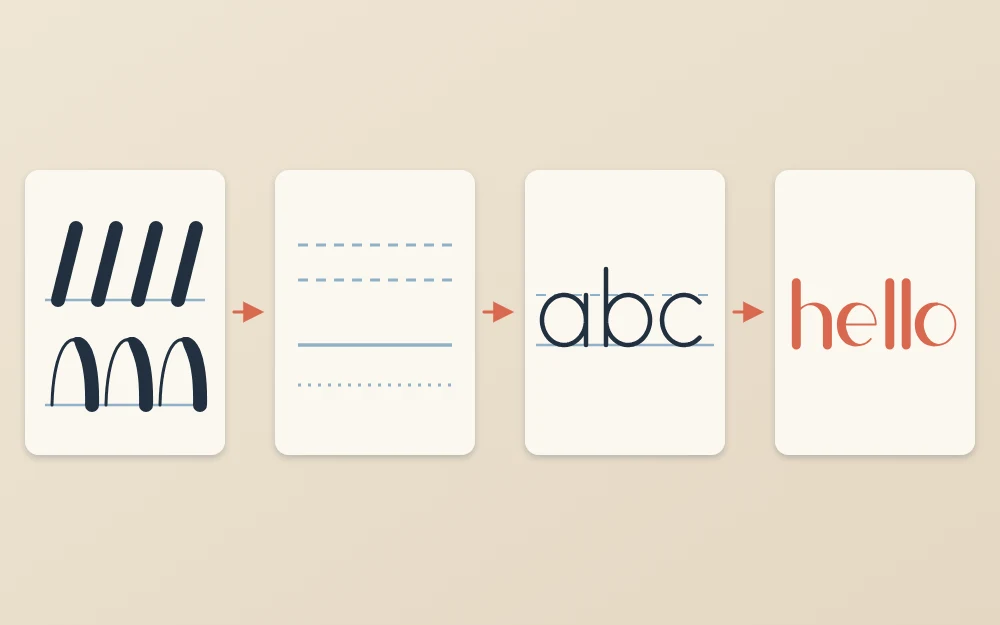
Follow the arrows in the illustration from left to right. The finished word in the last tile contains everything from the first three: the same strokes, sitting on the same kind of lines, forming the same simple letters. Nothing in it is new; it is only combined.
How long to practice
Short and regular works better than long and rare. Around 15 to 20 minutes on most days is plenty for a beginner, and even 10 minutes keeps the movements fresh. A two-hour session once a fortnight mostly teaches you how tired a hand can get.
Give each session one focus. One day it might be ovals, another day the letters built from arches, another day a single word drawn five times. Write the date in the corner of the page and keep the pages together in a folder.
Tip
Stop while a session is still going well. Ending on a row you like makes it easier to sit down again tomorrow.
What progress really looks like
Progress in lettering is gradual and uneven. Roughly speaking, many beginners see steadier lines and more even letter heights within the first few weeks of regular practice, while spacing and consistent curves take longer. Your own pace may be faster or slower, and both are fine.
Expect some flat stretches, and the occasional session where everything looks worse than last week. That usually means your eye has improved faster than your hand: you now notice faults you could not see before. Looking back at a dated page from a month ago is the fairest way to measure change.
Common worries, answered
“My lines are shaky”
Shaky lines mostly come from drawing very slowly with a tight grip. Loosen your hold, move from the forearm for longer strokes and use a steady medium speed. Turning the paper so that you pull each stroke toward you also helps.
“I keep erasing”
Good. Erasing is how lettering is done. Sketch lightly so that corrections lift cleanly, and treat the first pencil version as a draft that is supposed to change.
“I am left-handed”
Everything here works for left-handed readers. To avoid smudges, place a scrap sheet under your hand, let ink dry before moving across it and turn the paper to whatever angle keeps your hand below the line you are working on.
“I do not have a style”
Nobody does at first. A personal style grows out of many small preferences, such as slightly narrower letters or rounder arches, that show up once the basic shapes are reliable. It cannot be chosen in advance, and it does not need to be.
Common mistake
Starting with a full quote in ink. Long phrases multiply every beginner problem at once. One word in pencil teaches more.
A plan for your first session
If you would like to begin today, here is a simple plan of about 20 minutes:
- Rule three sets of guide lines with a baseline and an x-height line about 3/8 in (1 cm) apart.
- Fill the first set with straight downstrokes, evenly spaced and all leaning the same way.
- Fill the second set with arches, like a row of the letter n without lifting much between them.
- Fill the third set with ovals, a little narrower than circles.
- Circle the three best shapes on the page, date it and put it away.
That is a complete first lesson. Tomorrow, repeat it with two different strokes, and by the end of the week you will have a small stack of pages and a clear sense of what to work on next.
Frequently asked questions
Can I learn hand lettering if my handwriting is bad?
Yes. Lettering is drawing, not writing. You sketch each letter slowly in pencil, compare it with the guide lines and the letters beside it, and correct it before inking. Everyday handwriting relies on speed and habit, so it says very little about how well you will be able to draw careful letter shapes.
How long does it take to get good at hand lettering?
It varies a lot, and there is no honest fixed timeline. With short, regular practice many beginners notice steadier lines and more even letter sizes within a few weeks, while spacing and layout take longer to develop. Keeping dated practice pages lets you see gradual improvement that is hard to notice day to day.
What should I practice first as a beginner?
Start with basic strokes on ruled guide lines: straight downstrokes, arches, cups and ovals drawn in rows. They train control and consistency more efficiently than whole words. After a few sessions, combine them into a simple lowercase alphabet at one line weight, then try a single short word in pencil before using ink.