Consistent Lettering: How to Keep Size, Slant and Weight Even
Find out why a word looks uneven when the letters look fine, and fix it by checking four things: height, slant, stroke weight and shared letter shapes.
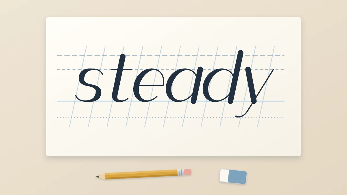
You draw a good “a”, a decent “n” and a respectable “d”, put them side by side, and the word still looks unsettled. This is one of the most common stages in learning to letter, and it is a sign of progress: your single letters are now good enough that the problem has moved to how they relate to each other.
Consistent lettering comes down to four things a reader’s eye compares without noticing: height, slant, weight and shape. When all four repeat across a word, it looks calm and deliberate, even if no single letter is perfect. When one of them varies, the whole word looks shaky.
Why a word can look uneven when the letters are fine
A word is read as a pattern before it is read as letters. Repeated verticals, repeated curves and a level top and bottom edge form a rhythm, and the eye is quick to catch anything that breaks it. One letter that sits a little high stands out the way one crooked fence post does.
That is useful news. It means you rarely need to redraw everything. You need to find which of the four properties is drifting and correct that one.
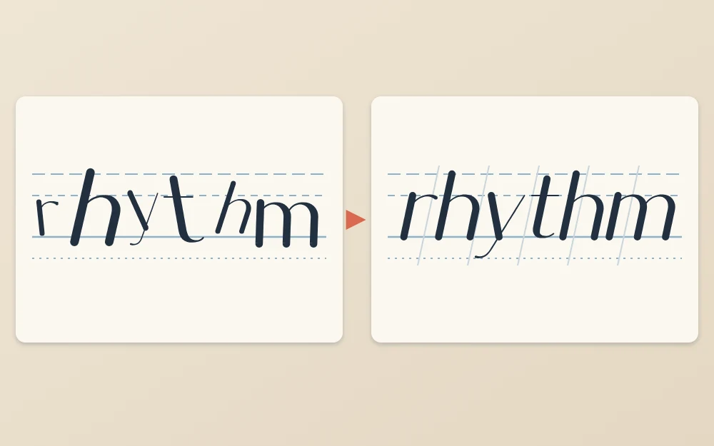
Height: every letter touches the lines
Small letters such as a, n, o and e should reach exactly from the baseline to the x-height line. Ascenders on b, d, h, k and l should all rise to one height, and descenders on g, p and y should all drop to one depth. Without ruled lines this is very hard to judge, so the first fix is always to rule them; the guide to drawing baselines and guide lines covers how.
With lines in place, two habits cause most height problems:
- Floating. Letters stop just short of the baseline or the x-height line. Aim to touch the line, not to approach it.
- Shrinking. Letters get smaller toward the end of a word as attention fades. Slow down for the last two letters.
Round letters are a small exception: an “o” that touches both lines exactly can look slightly small, so let curves pass each line by a hair.
Slant: one angle for the whole word
Upright or leaning, it does not matter which, as long as every downstroke agrees. Mixed slant is easy to miss in single letters and obvious in a word, because neighboring stems either converge or spread apart.
To check, lay a ruler along the stem of the first letter and slide it across the word without turning it. Every stem should stay parallel to the ruler’s edge. To prevent the problem, rule light slant lines across your guide lines before you sketch, and keep each downstroke parallel to the nearest one.
Turning the paper also helps. Rotate the sheet until your slant lines point straight toward you, so every downstroke becomes a simple pull toward your body. Left-handed letterers often need a different rotation from right-handed ones; try a few angles until the pull feels natural and your hand stays clear of wet ink.
Weight: thick strokes that match
If your style has thick strokes, they should all be the same width, and so should the thin ones. How you control that depends on the tool.
- Drawn weight. In faux calligraphy and block styles, done with a fineliner or pencil, the thick parts are drawn as two edges and filled. Make a gauge: mark the stroke width on the edge of a scrap of paper and hold it against each thick stroke.
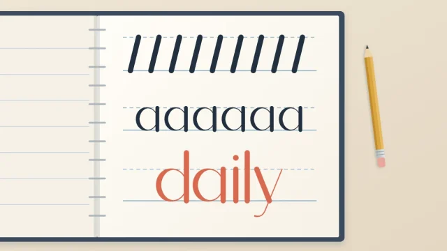
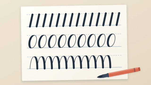
- Pressed weight. With a brush pen, the width comes from pressure on a flexible tip, so matching widths means repeating the same pressure on every downstroke. Rows of parallel downstrokes train exactly this.
Monoline letters have one weight by definition, but they can still vary if you switch pens partway or go over some lines twice. Retrace everything or nothing.
Shape: related letters share parts
The lowercase alphabet is built from a few repeated forms. The oval inside “a” is the oval of d, g, o and q. The arch of “n” is the arch of h and m, and, turned over, the cup of “u”. If your “a” has a narrow oval and your “o” a fat round one, the word will look as if two people lettered it.
Decide on one oval and one arch for a piece: how wide, how round, how steeply it leans. Then draw a row of each before you start, as a reference to glance back at. Practicing those shared forms in rows is what warm-up drills for ovals and arches are for.
A checklist for a finished word
Run through these while the word is still in pencil, when fixes are cheap.
- Do all the small letters touch both the baseline and the x-height line?
- Do ascenders share one height and descenders one depth?
- Are all the downstrokes parallel?
- Are the thick strokes one width, and the thin strokes one width?
- Do the round letters share one oval and the arched letters one arch?
- Does the white space between letters look even?
The last item is a subject of its own; uneven gaps can make a perfectly regular word look irregular. See the guide to spacing letters and words if that is the item you keep failing.
Turn the page upside down
When you look at a word the right way up, you read it, and reading hides flaws. Turn the sheet upside down and the word becomes a row of abstract shapes. A stem that leans, an oval that is too wide or a letter that floats above the line is suddenly easy to see.
Two other quick views do similar work. Hold the sheet at arm’s length and squint, which blurs detail and shows weight as patches of gray. Or look at the back of thin paper against a window, which shows the word mirrored.
Tip
Fix one property per attempt. Redraw the word correcting only height, then again correcting only slant. Chasing all four at once usually improves none of them.
Expect it to come gradually
Consistency is less a technique than a habit of checking, and habits form slowly. Your first corrected words may look stiff, because you are steering every stroke. With regular practice the checks start to happen while you draw instead of afterward, and the stiffness eases. There is no fixed timetable for that, and uneven days are normal along the way.
Frequently asked questions
Why does my lettering look messy even with guide lines?
Guide lines control height only. If the word still looks untidy, check the other three properties: whether the downstrokes are parallel, whether thick strokes share one width, and whether related letters such as a, d and o use one oval. Uneven gaps between letters are another frequent cause.
How do I keep the same slant in every letter?
Rule light slant lines across the page at your chosen angle before sketching, and keep each downstroke parallel to the nearest line. Rotating the paper so those lines point toward you turns every downstroke into a straight pull, which most people find easier to repeat accurately.
Does consistent mean every letter must be identical?
No. Hand lettering is expected to show small variations, and they are part of its character. Consistency means the main measurements repeat closely enough that nothing distracts the eye: heights, slant, stroke width and the basic oval and arch. Tiny differences inside that framework look natural, not careless.