Hand Lettering Mistakes: 10 Beginner Problems and How to Fix Them
Ten common beginner lettering problems, from drifting words to shaky lines and uneven gaps, each with its likely cause and one concrete fix to try on your next practice page.
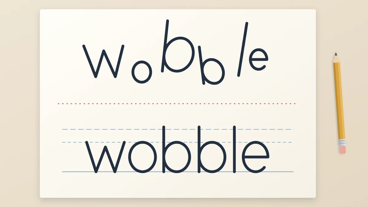
Most hand lettering mistakes have nothing to do with talent. They come from a small set of habits that nearly every beginner picks up, and each one leaves a recognizable mark on the page: a word that climbs uphill, letters that swell and shrink, lines that tremble.
The ten problems below are grouped by where they show up. Each comes with its likely cause and one concrete fix to try on your next page. Pick the two that look most like your own work and start there, because trying to correct everything at once rarely sticks.
Setup mistakes that happen before the first letter
1. Skipping guide lines
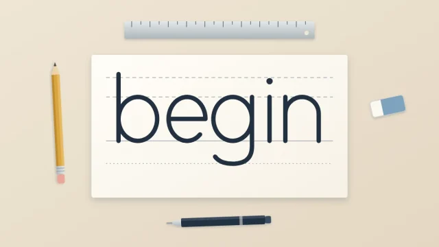
Without a ruled baseline and x-height line, your eye has to guess the height of every letter, and it guesses a little differently each time. Words drift up or down, and tall letters stop at random heights.
Fix: rule at least a baseline and an x-height line in light pencil before every word, practice pages included. The guide to ruling lettering guidelines covers the full set of lines and the proportions between them.
2. Going straight to ink
Ink cannot be moved. Lettering is drawn, so it is allowed to be sketched, checked and corrected before anything becomes permanent.
Fix: sketch each word as a light pencil skeleton, adjust it, and only then ink. Let the ink dry fully before you erase. If you are left-handed, rest your hand on a scrap sheet and turn the paper so your hand trails away from wet lines.
3. Paper that feathers
When the edges of a line look fuzzy, or ink creeps outward in tiny hairs, the paper is pulling ink sideways. No amount of hand control fixes that.
Fix: test your pen in a corner of the sheet before you start, and move to a smoother sheet if the line spreads. The article on choosing paper for lettering practice explains feathering, bleeding and which paper types to avoid.
Size and slant problems
4. Letters that change size
The usual cause is lowercase letters that do not touch both lines. A round letter that stops just short of the x-height line looks smaller than the letter beside it, even when the difference is tiny.
Fix: after sketching, run your pencil tip along the x-height line and check that every a, e, n and o reaches it and also sits on the baseline. Redraw any letter that floats or sinks.
5. Uneven slant
When stems lean at slightly different angles, a word looks restless even if each letter is well formed.
Fix: choose either fully upright letters or one slant. Rule a few light slant lines across your guide lines and match every stem to them. Keeping height, slant and weight even across a whole word is the subject of the guide to consistent lettering.
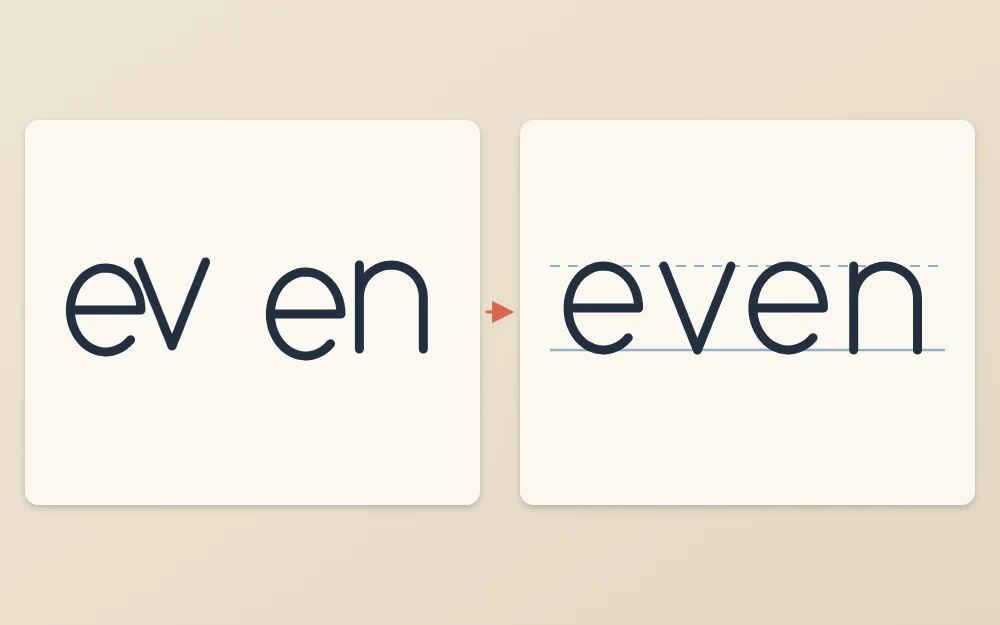
Spacing that is cramped in one place and gappy in another
6. Measuring gaps instead of judging them
Equal distances between letters do not look equal, because letters have differently shaped sides. Two straight stems side by side need more room than two round letters, and a letter with an open side, such as r or t, brings extra white space with it.
Fix: squint at your pencil sketch until the letters blur, then look only at the white shapes between them. Nudge letters until those shapes look about the same size. The full method is in the guide to spacing letters and words.
Line quality problems
7. Shaky lines
Two things usually cause a wobble: drawing very slowly and gripping the pen hard. A slow stroke gives every small tremor time to show, and a tight grip locks the fingers so they cannot move smoothly.
Fix: loosen your grip until someone could slide the pen out of your fingers. Draw at a steady, medium speed, move from the forearm on long strokes, pull strokes toward you, and turn the paper instead of twisting your wrist.
8. Thick strokes in the wrong places
In thick-and-thin styles, the thick parts are the downstrokes: every place the pen traveled down the page. Upstrokes and the thin joins between letters stay thin. With a brush pen, the thickness comes from pressing harder on the way down. With a fineliner or pencil, it is drawn in afterward as a second line.
Fix: before thickening anything, put a tiny pencil dot beside each downstroke in your skeleton. Thicken only the dotted strokes, and keep them all the same width.
Common mistake
Thickening both sides of a round letter. In an o, only the side where the pen moves downward gets heavy. The side where it climbs back up stays thin.
Practice habits that slow you down
9. Copying a font or another artist
It feels like a shortcut, but it teaches you the outlines of finished shapes without showing why they look the way they do. You end up unable to draw a letter that was not in the sample, and the result is not your own work.
Fix: learn the eight basic strokes (upstroke, downstroke, overturn, underturn, compound curve, oval, ascending loop and descending loop) and build your letters from them. An alphabet made that way belongs to you and can be changed at will.
10. Practicing whole quotes before strokes
A quote contains dozens of letters, many spacing decisions and a layout. When it looks off, you cannot tell which part failed, so nothing specific improves.
Fix: spend most of a session on rows of single strokes and letters, then finish with one short word. Save full quotes for when single words look steady.
How to find your own main problem
You do not need someone else to diagnose your page. A short routine does it.
- Letter one short word, such as “even” or “minimum”, on ruled guide lines in pencil.
- Prop the sheet up and step back about an arm’s length.
- Turn the page upside down. You stop reading the word and start seeing shapes.
- Check in this order: heights, slant, spacing, stroke weight.
- Write the single biggest problem in the margin.
- On the next page, work on that one thing only.
What steady improvement looks like
Progress in lettering is gradual and uneven. Some sessions feel worse than the one before, usually because your eye has improved faster than your hand and now notices more.
Fix one habit, give it several sessions, then move to the next.
Frequently asked questions
Why does my hand lettering look uneven?
Unevenness usually comes from one of four things: letters that do not all reach the same guide lines, stems that lean at different angles, gaps that vary between letters, or thick strokes of different widths. Turn the page upside down and check those four in order to see which one is causing most of the trouble.
Do I need good handwriting to do hand lettering?
No. Handwriting is fast and automatic, while lettering is slow drawing with guide lines, a pencil sketch and corrections. People with untidy handwriting can letter well, because the two rely on different habits. What matters more is patience with sketching and a willingness to redraw a letter that looks wrong.
How long does it take to stop making beginner lettering mistakes?
There is no fixed timeline, and it varies a lot from person to person. Guide lines and pencil sketching improve most pages right away. Steadier lines and better spacing tend to come gradually over weeks of short, regular practice. Expect uneven progress, with some sessions looking worse than the one before.